Syllabus
Synopsis
In this competitive global environment, the ability to explore visual representation of business data interactively and to detect meaningful patterns, trends and exceptions from these data are increasingly becoming an important skill for data analysts and business practitioners. Drawing from research and practice on Data Visualisation, Human-Computer Interaction, Data Analytics, Data Mining and Usability Engineering, this course aims to share with you how visual analytics techniques can be used to interact with data from various sources and formats, explore relationship, ’‘’detect the expected and discover the unexpected’’’ without having to deal with complex statistical formulas and programming.
The goals of this course are:
- To share with you the principles, best practices and methods of visual analytics
- To provide you hands-on experiences in using commercial-off-the-shelf visual analytics software and programming tools to design visual analytics applications
Learning Objectives
Upon successful completion of the course, students will be able to:
- Understand the basic concepts, theories and methodologies of visual analytics.
- Analyse data using appropriate visual thinking and visual analytics techniques.
- Present data using appropriate visual communication and graphical methods.
- Design and implement cutting-edge visual analytics system for supporting decision making.
Competencies
- Explaining the concepts and principles of Visual Analytics.
- Describing the differences between Visual Analytics, Data Visualisation, Statistical Graphs and Infographics.
- Explaining the basic concept of visual variables and applying these concepts and best practices in designing data-driven static graphs.
- Explaining interactive techniques and best practices, and applying these techniques in designing interactive data visualisation.
- Understanding the data characteristics of numerical data and building data visualisation by using appropriate visually driven univariate and bivariate data analytics methods.
- Understanding the characteristics of multivariate data and building data visualisation by using appropriate multivariate visualisation methods.
- Understanding the characteristics of time-series data and building data visualisation by using appropriate time-series visualisation methods.
- Understanding the characteristics of geographical data and building data visualisation by using appropriate geovisualisation methods.
- Understanding the characteristics of network data and building data visualisation by using appropriate network graph visualisation methods.
- Explain the concepts and principles of Information Dashboard.
- Building analytical dashboard by using Commercial off-the-shelf (COTS) software.
- Designing visual analytics application programmatically by using free and open source software and packages.
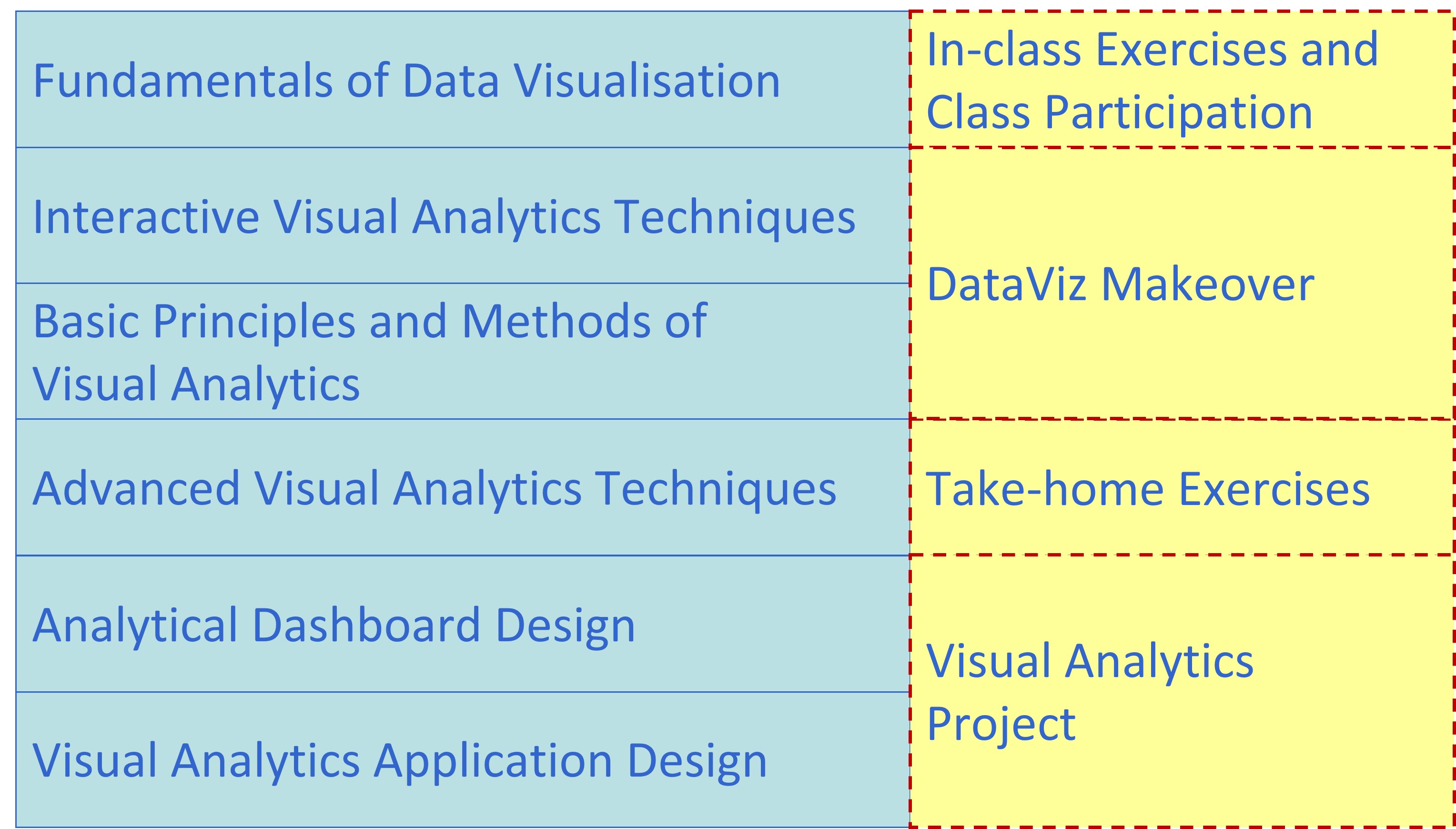
Basic Modules
This course comprises ten integrated components as shown below:
Prerequisites
There are no prerequisites for the class. However, students taking this course must be willing to learn R programming framework. For students who are new to R, you are encouraged to consult the following resources prior to the lesson starts:
- Garrett Grolemund & Hadley Wickham (2020) R for Data Science 2e. This book is highly recommended to anybody who are interested to understand how to do ’‘’Modern Data Science’’’ by using ’‘’tidyverse’’’ principles and methods.
- 王敏杰 数据科学中的 R 语言.
You don’t have to finish reading either one of them before lesson starts. Take your time, review them from time to time. You will find yourself learning something new each time you revisit the book.
Grading Summary
The grading distribution of this course is as follows:
- Pre-lesson Preparation and Hands-on Exercise 15%
- In-class Exercise and Class Participation 15%
- Take-home Exercise 40%
- Visual Analytics Project 30%
Hands-on Exercise and In-class Exercise Grading division
- D failed to submit by submission deadline.
- C late submission beyond submission deadline.
- B- submitted on time but completed 50% or less of the exercise.
- B submitted on time but completed 75% or less of the exercise.
- B+ submitted on time and completed 100% of the exercise.
- A- submitted on time, completed 100% of the exercise by applying appropriate design principles and explore at least three extra alternatives correctly.
- A submitted on time, completed 100% of the exercise by applying appropriate design principles and explore at least five extra alternatives correctly.
There will be no mid-term test and final examination for this course.
Course Components
The assessment for this course consists of four major components, namely:
- Pre-lesson Preparation and Hands-on Exercise
- In-class Exercise and Class Participation
- Take-home exercises
- Visual Analytics Project
Pre-lesson Preparation and Hands-on Exercise
Pre-lesson videos/slides and recommended readings exercises will be released one week before the weekly lesson starts. A strict requirement for each class meeting is to complete the assigned readings and video before coming to class. Students are encouraged to post question or issue encountered while viewing the video or reading the recommended articles on Piazza. Student sharing of insights from readings of assigned materials on Piazza will form a large part of the learning in this course. After learning the data visuaisation concepts and methods from lesson materials, the hands-on exercises aim to provide students the opportunity to gain hands-on experience on using selected R packages. It is important for students to complete the hands-on exercises before class. This is because the in-class discussion will extend the methods learned from the hands-on exercise to advanced modelling.
In-class Exercise and Class Participation
During lesson, students are required to complete a series of in-class exercises using either Tableau or R. The in-class discussion will focus on how to critic existing data visualisation and how to deliver effective visual communication. In general, these exercises are guided interactively. By the end of each lesson, students are required to publish their in-class exercise on Tableau Public or Netlify.
Take-home Exercise
The take-home exercise provides students with the opportunity to revise and practice the R packages and programming skills they had learned in class at home. It is a weekly exercise. Each exercise is designed to be completed within 3-5 hours. The exercise is not a repetition of the in-class exercise but it requires students to be innovative and creative in applying appropriate R packages to design enlightening and yet functional data visualisation for analytics purposes.
Students may work together to help one another with R programming issues and discuss the materials that constitute the take-home exercise. However, each student is required to prepare and submit the take-home exercise (including any computer work) on their own. Cheating is strictly prohibited. Cheating includes but not limited to: plagiarism and submission of work that is not the student’s
Visual Analytics Project
The purpose of the project is to provide students first hand experience on building web-enabled visual analytics application by using Shiny. It aims to democratize data and analytics. Hence, the application focuses and emphasises on interactivity and effective integration of techniques from data analytics and data visualization.
For more details please refer to Visual Analytics Project page.
Core Readings
Claus. O. Wilke (2019) Fundamentals of Data Visualisation, O’Reilly. USA
Cairo, Alberto (2013) The Functional Art: An Introduction to Information Graphics and Visualization, New Riders, Berkeley, CA. This book is available at SMU eLibrary.
Few, Stephen (2004) Show Me the Numbers: Designing Tables and Graphs to Enlighten, Analytics Press, Oakland, USA.
Few, Stephen (2009) Now You See It: Simple Visualization Techniques for Quantitative Analysis, Analytics Press, Oakland, USA.