Lesson 10:
Information Dashboard Design
Dr. Kam Tin Seong
Assoc. Professor of Information Systems (Practice)
School of Computing and Information Systems,
Singapore Management University
20 May 2025
Content
Introducing information dashboard
Information dashboard design best practices
Common mistakes in dashboard design
Ideal graphs for information dashboard
- Bullet graph
- Sparklines
- Bandlines
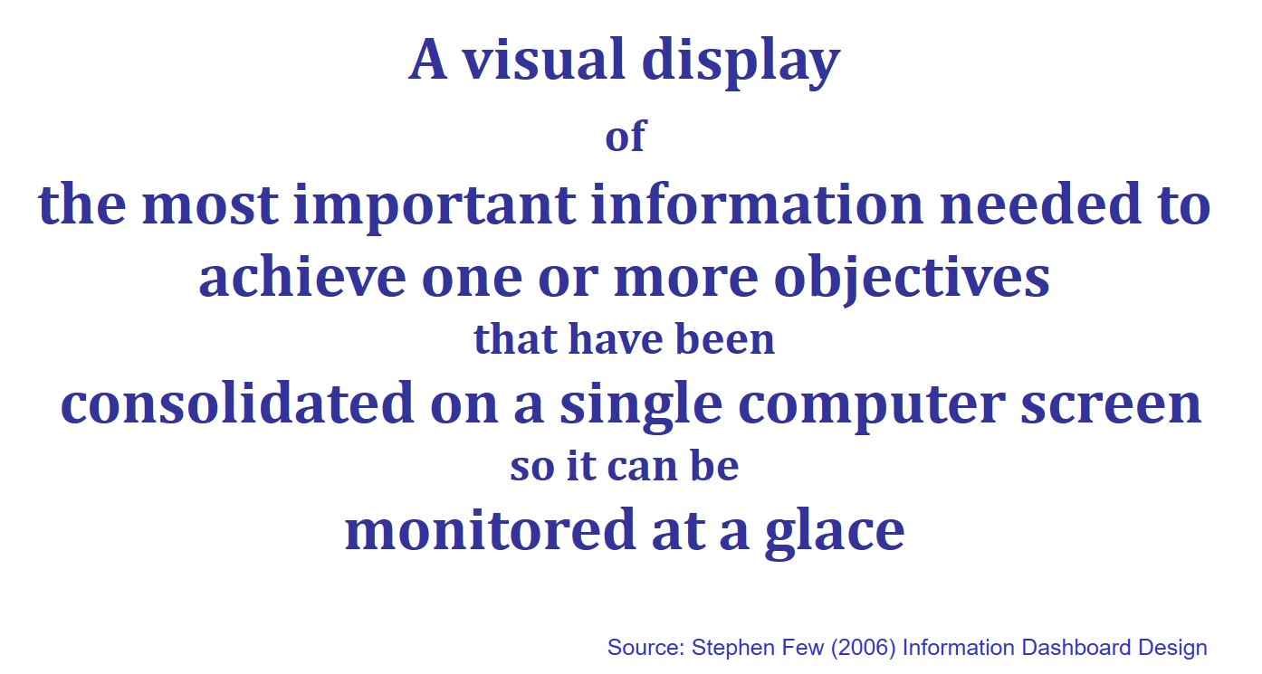
Why are dashboards so important?
- A well-designed performance dashboard helps you to see more clearly by helping you to understand each fact more quickly so you can find patterns in the storm.
Classifying Dashboards by Role
Dashboards for strategic purpose
Dashboards for operational purpose
Dashboards for analytics purpose
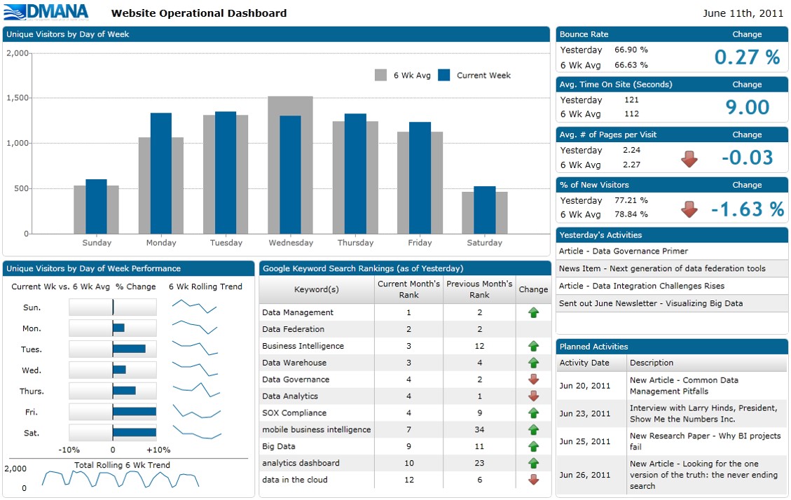
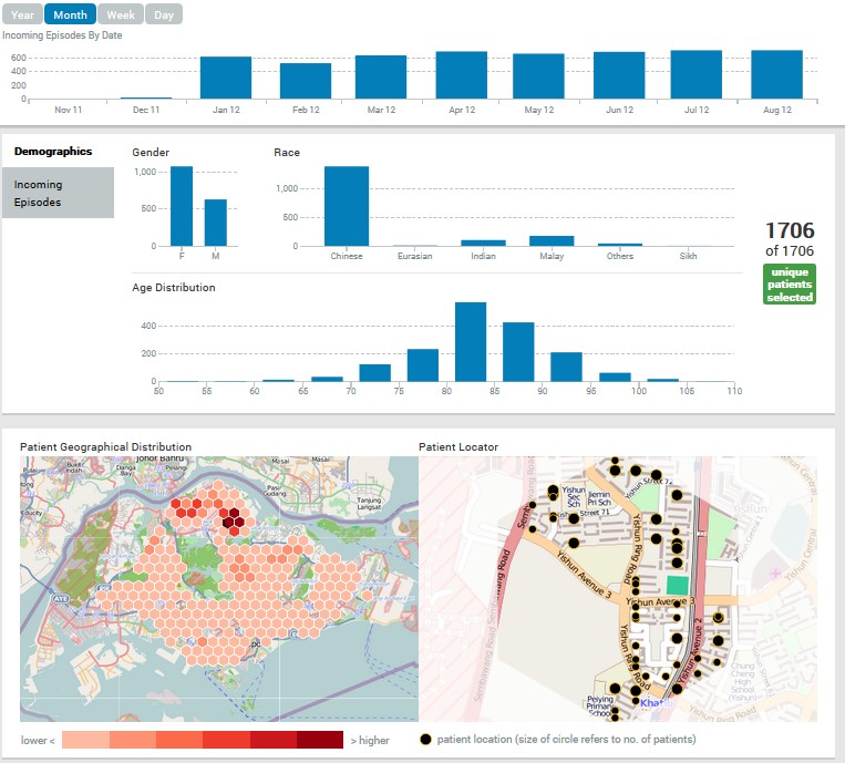
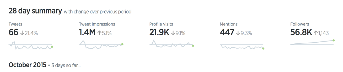
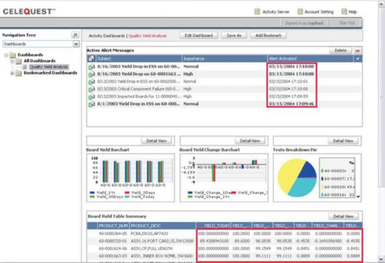
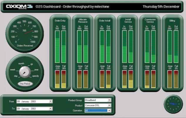
Dashboards for operational purpose
![]()
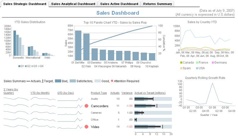
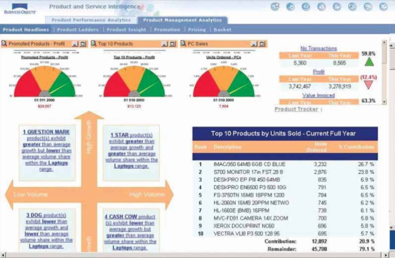
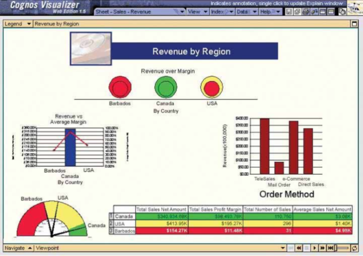
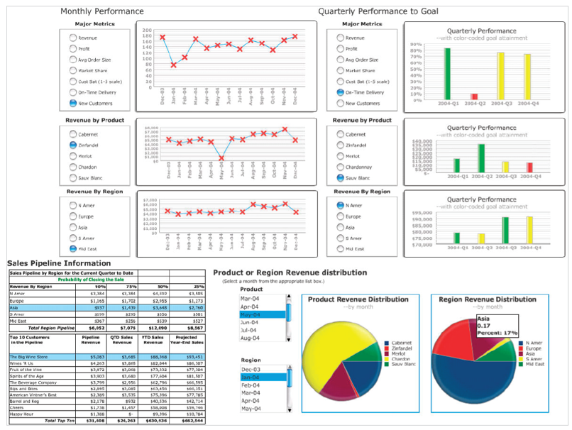
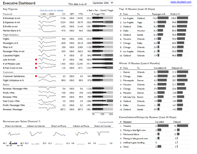
Dashboards for strategic purpose
![]()
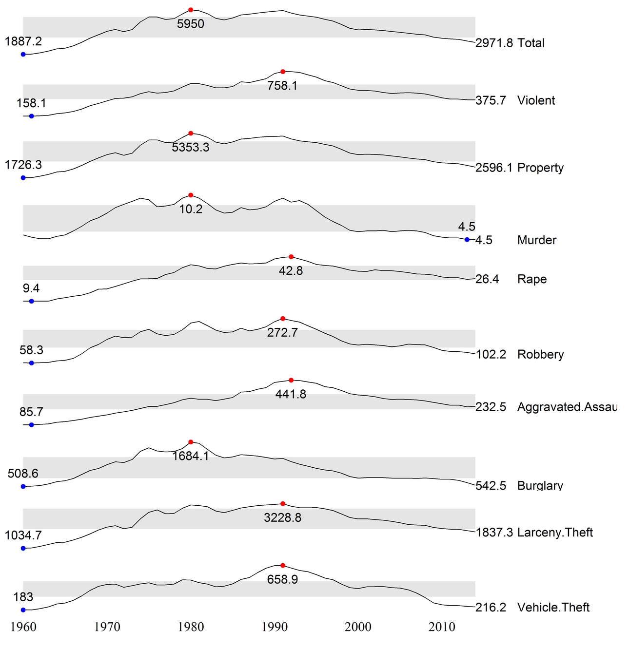
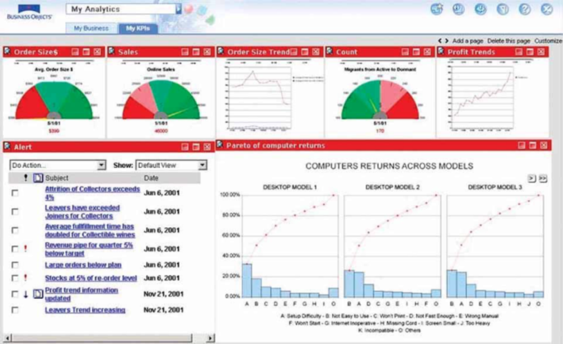
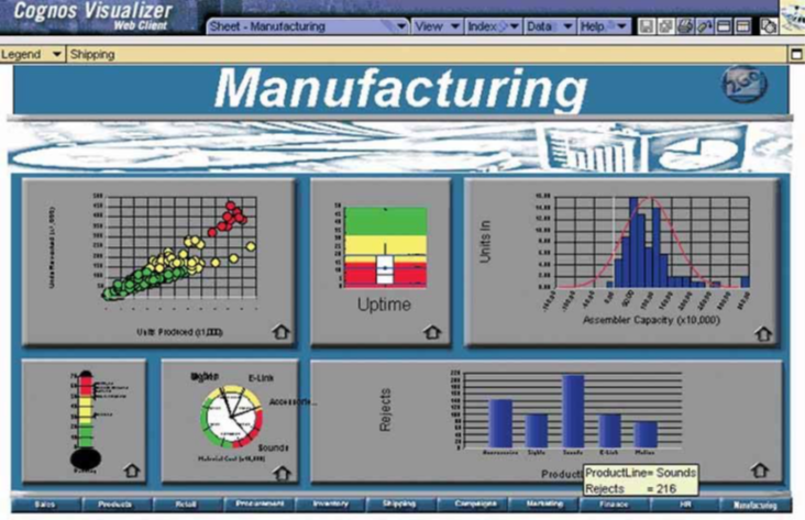
Dashboards for analytics purpose
![]()
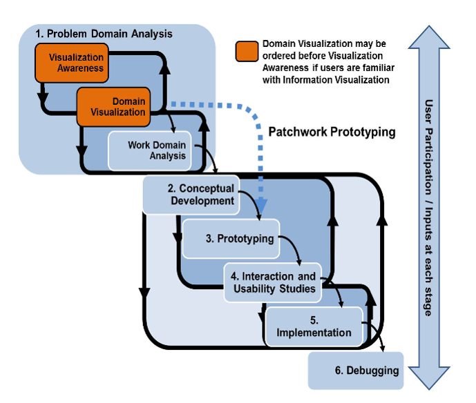
Best Practices for Dashboard Design
- Preparing stage
- Target the user
- Know what value your dashboard will add
- Display only actionable information
- Design stage
- Right tool for the right job
- Context
- Layout and clarity
- Visual aesthetics
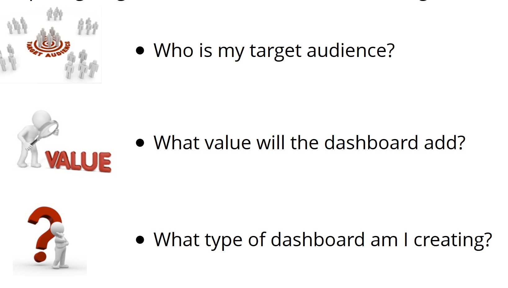
Preparing stage: Target the user
![]()
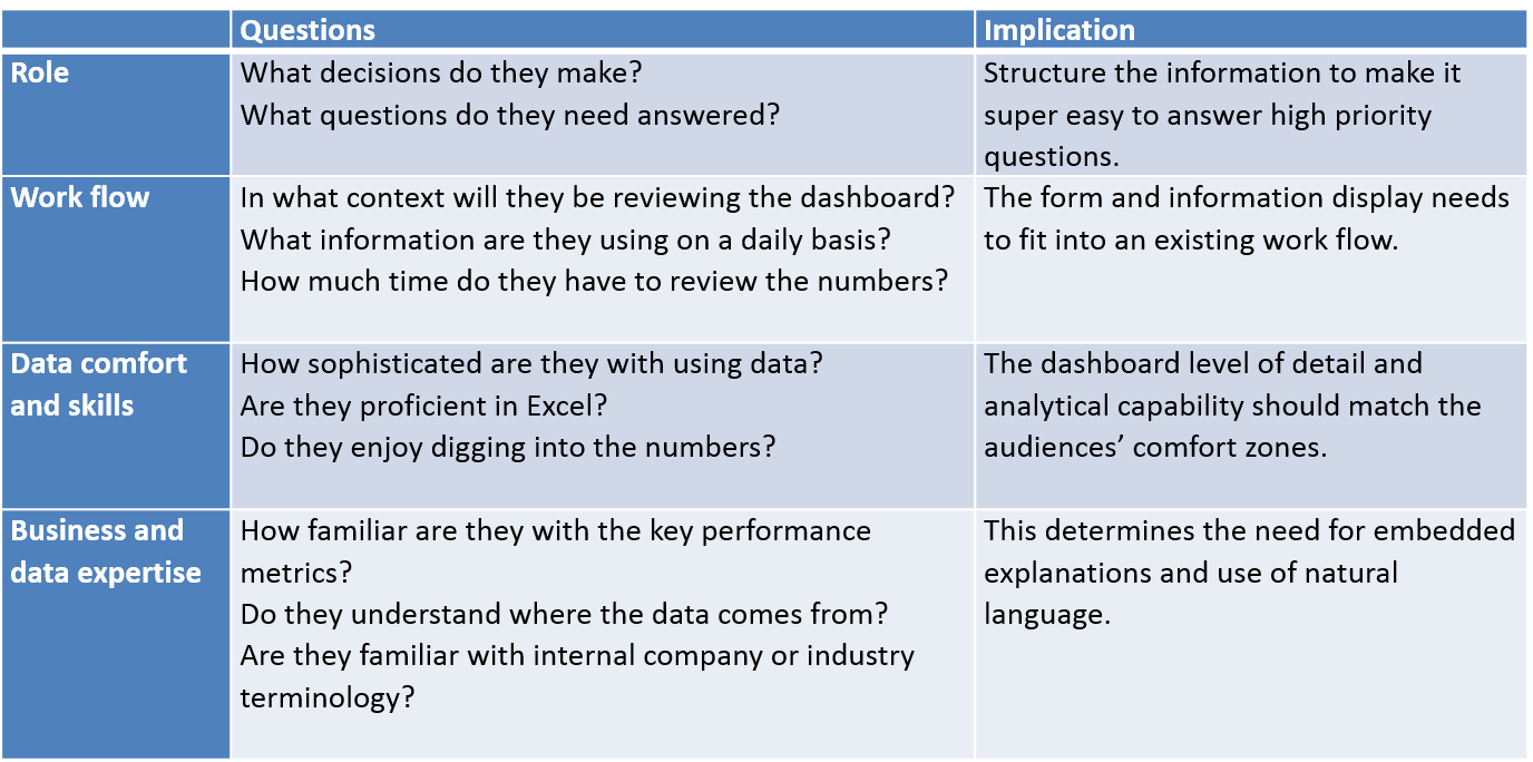
Preparing stage: A User-Centric Dashboard Design Guide
![]()
Preparing stage: A User-Centric Dashboard Design Guide
Who is my target audience?
![]()
Preparing stage: A User-Centric Dashboard Design Guide
What value will the dashboard bring?
- Help management define what is important.
- Educate people in the organization about the things that matter.
- Set goals and expectations for specific individuals or groups.
- Help executives sleep at night because they know what’s going on.
- Encourage specific actions in a timely manner.
- Highlight exceptions and provide alerts when problems occur.
- Communicate progress and success.
- Provide a common interface for interacting with and analysing important business data.
Preparing stage: A User-Centric Dashboard Design Guide
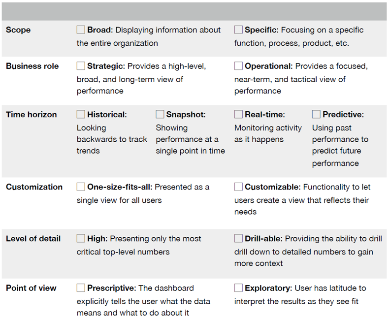
What type of dashboard am I creating?
![]()
Preparing stage: A User-Centric Dashboard Design Guide
Information Discrimination
Find the core
Ask a better question
Push to the appendix
Reporting vs exploration
Preparing stage: A User-Centric Dashboard Design Guide
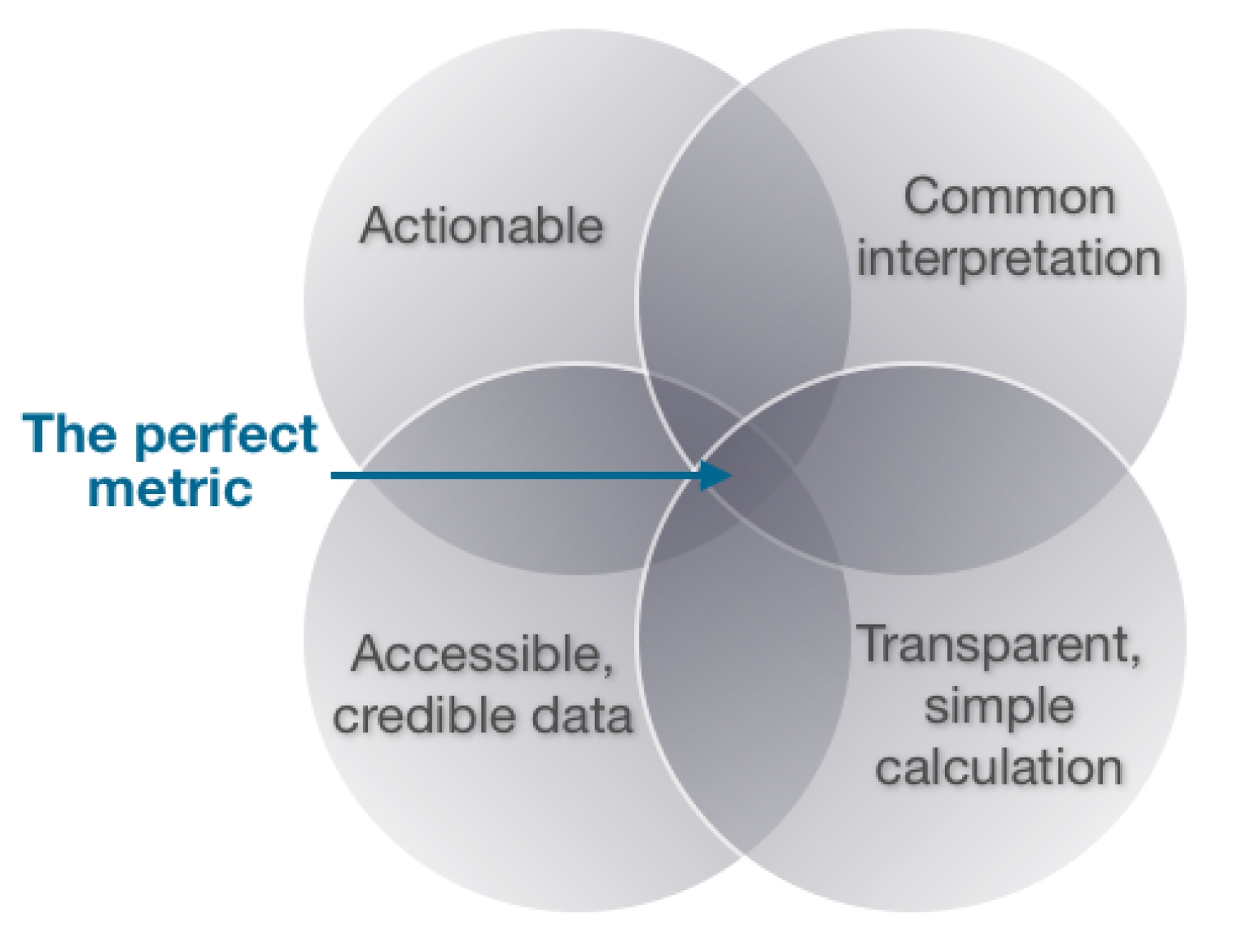
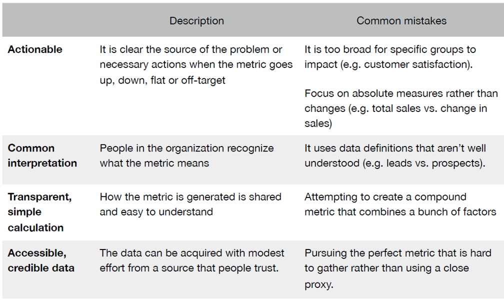
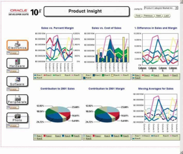
Choosing the perfect metric
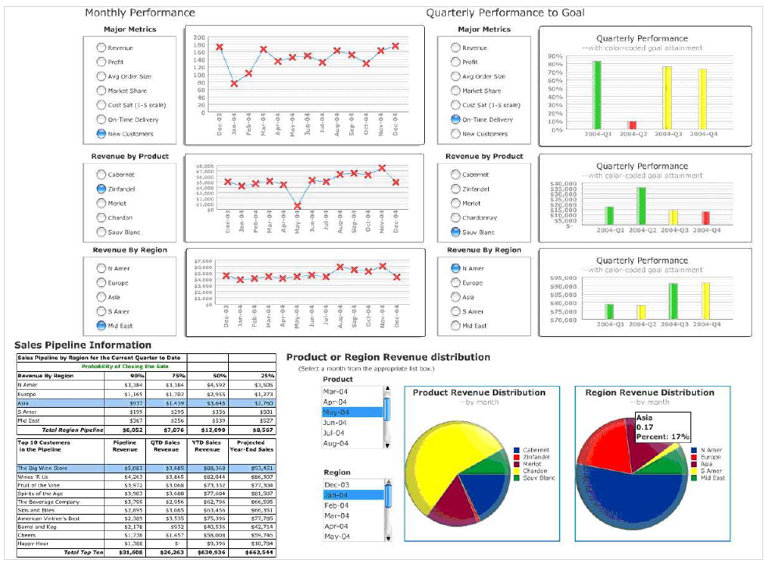
![]()
Preparing stage: A User-Centric Dashboard Design Guide
Choosing the perfect metric
![]()
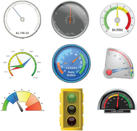
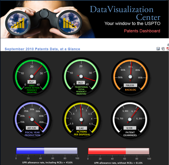
An assortment of typical dashboard gauges
![]()
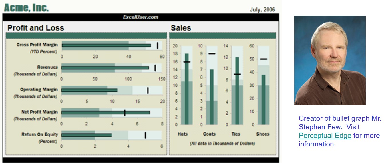
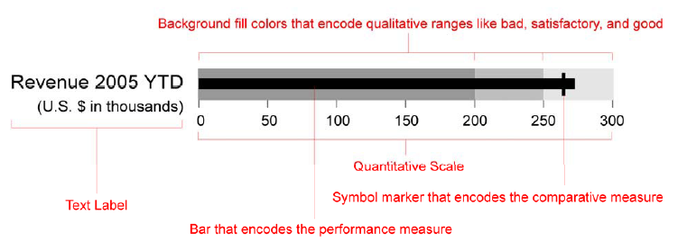
Bullet graph design specifications
![]()
Pre-attentive with colour and symbol
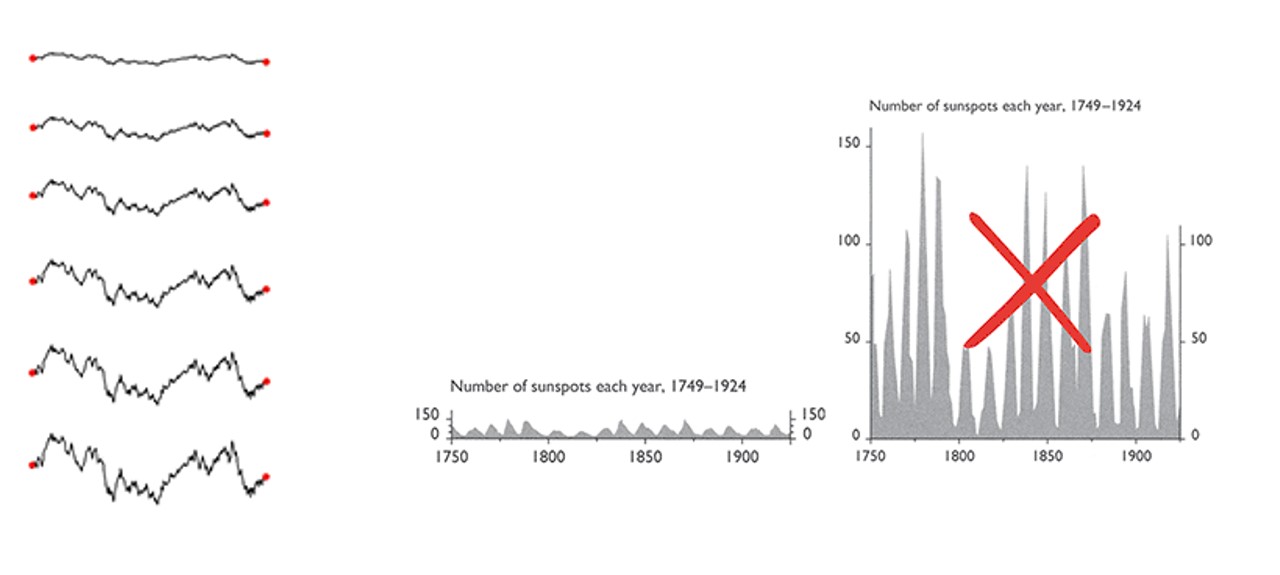
Aspect ratio
- A graphic’s width/height ratio makes a big difference in displaying data.
![]()
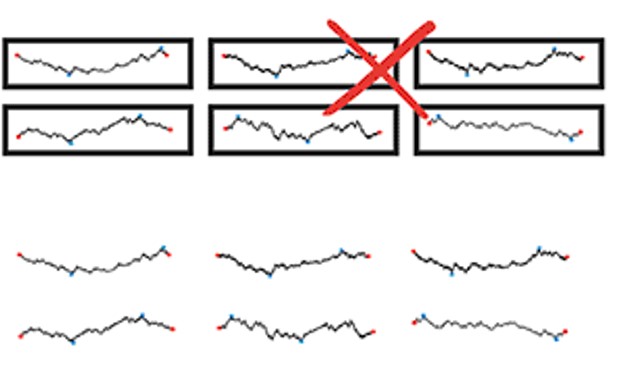
Unintentional optical clutter
- Areas surrounding data-lines may generate unintentional optical clutter. Strong frames produce melodramatic but content-diminishing visual effects.
![]()
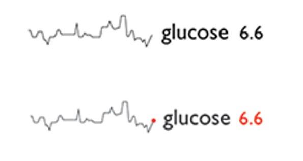
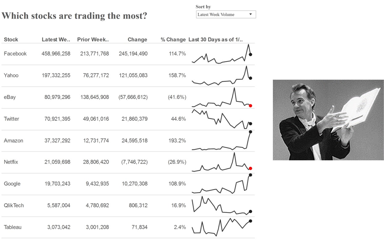
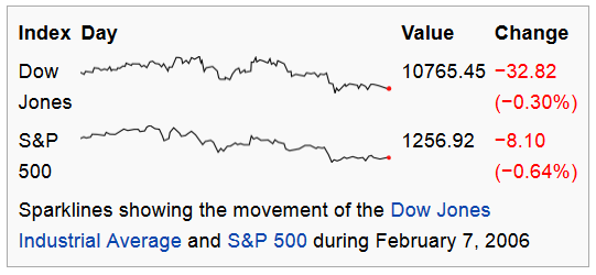
Sparklines best practice
![]()
Sparklines best practice
- Use reference line to provide context
![]()
Sparklines best practice
- Use reference region to provide context
![]()
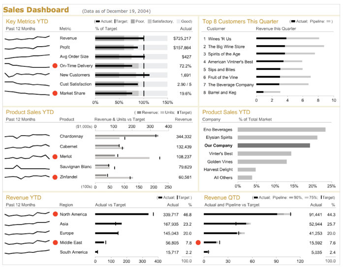
Best Practices for Dashboard Design
Common mistakes in dashboard design
Exceeding the boundaries of a single page
Supplying inadequate context for the data
Displaying excessive detail or precision
Exposing measure indirectly
Choosing inappropriate display media
Introducing meaningless variety
Using poorly designed display media
Encoding quantitative data inaccurately
Common mistakes in dashboard design
- Exceeding the boundaries of a single page and requiring the viewer to scroll
![]()
Common mistakes in dashboard design
- Fragmenting data into separate screen
![]()
Common mistakes in dashboard design
- Displaying excessive detail or precision
![]()
Common mistakes in dashboard design
- Introducing meaningless variety
![]()
Common mistakes in dashboard design
- Arranging the data poorly
![]()
Common mistakes in dashboard design
- Highlighting important data ineffectively or not
![]()
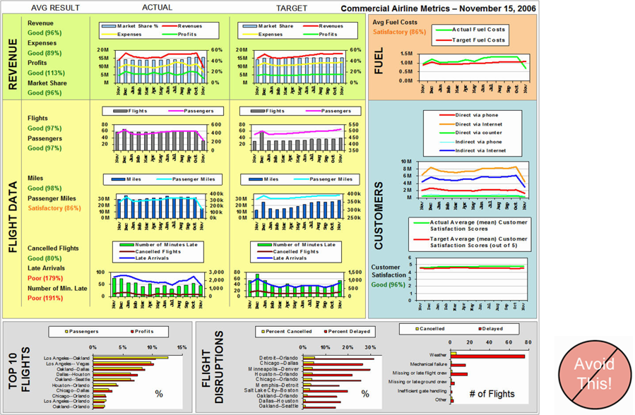
Common mistakes in dashboard design
- Cluttering the display with useless decoration
![]()
Common mistakes in dashboard design
- Misusing or overusing colour
![]()
Common mistakes in dashboard design
- Designing an unattractive visual display
![]()
Common mistakes in dashboard design
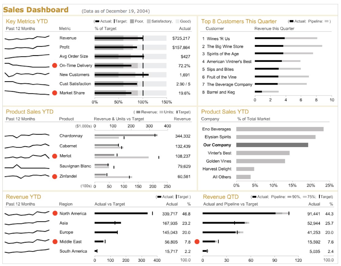
- Design that failed to reveal KPIs effectively
![]()
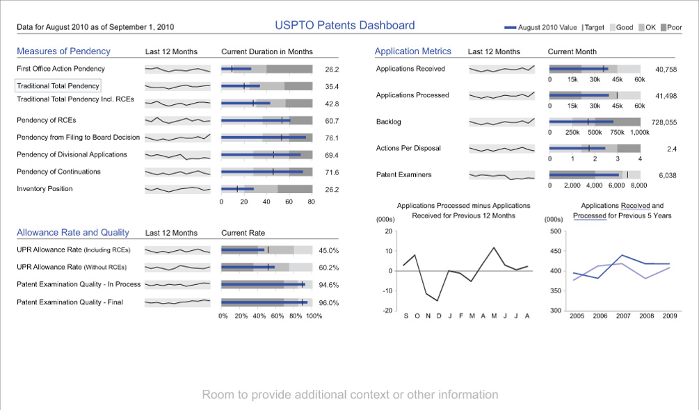
Alternative dashboard design
- Design that reveals KPIs effectively
![]()
Common mistakes in dashboard design
- Design with poor layout and clarity
![]()
Alternative dashboard design
- Design with good layout and clarity
![]()
Common mistakes in dashboard design
- Design with poor visual aestheticsness
![]()
Alternative dashboard design
- Design with good visual aestheticsness
![]()
References
Dashboard Design
References
Dashboard Design
References
Bullet Chart & Sparklines