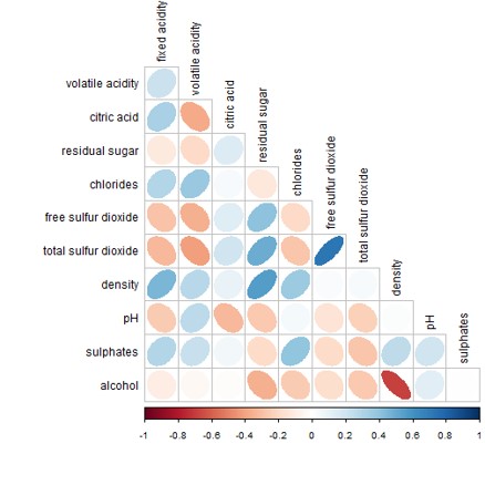
Lesson 5:
Visual Multivariate Analysis

Dr. Kam Tin Seong
Assoc. Professor of Information Systems (Practice)

School of Computing and Information Systems,
Singapore Management University

16 Jun 2025

Content

What will you learn from this lesson?

  • Understand the characteristics of multidimensional data
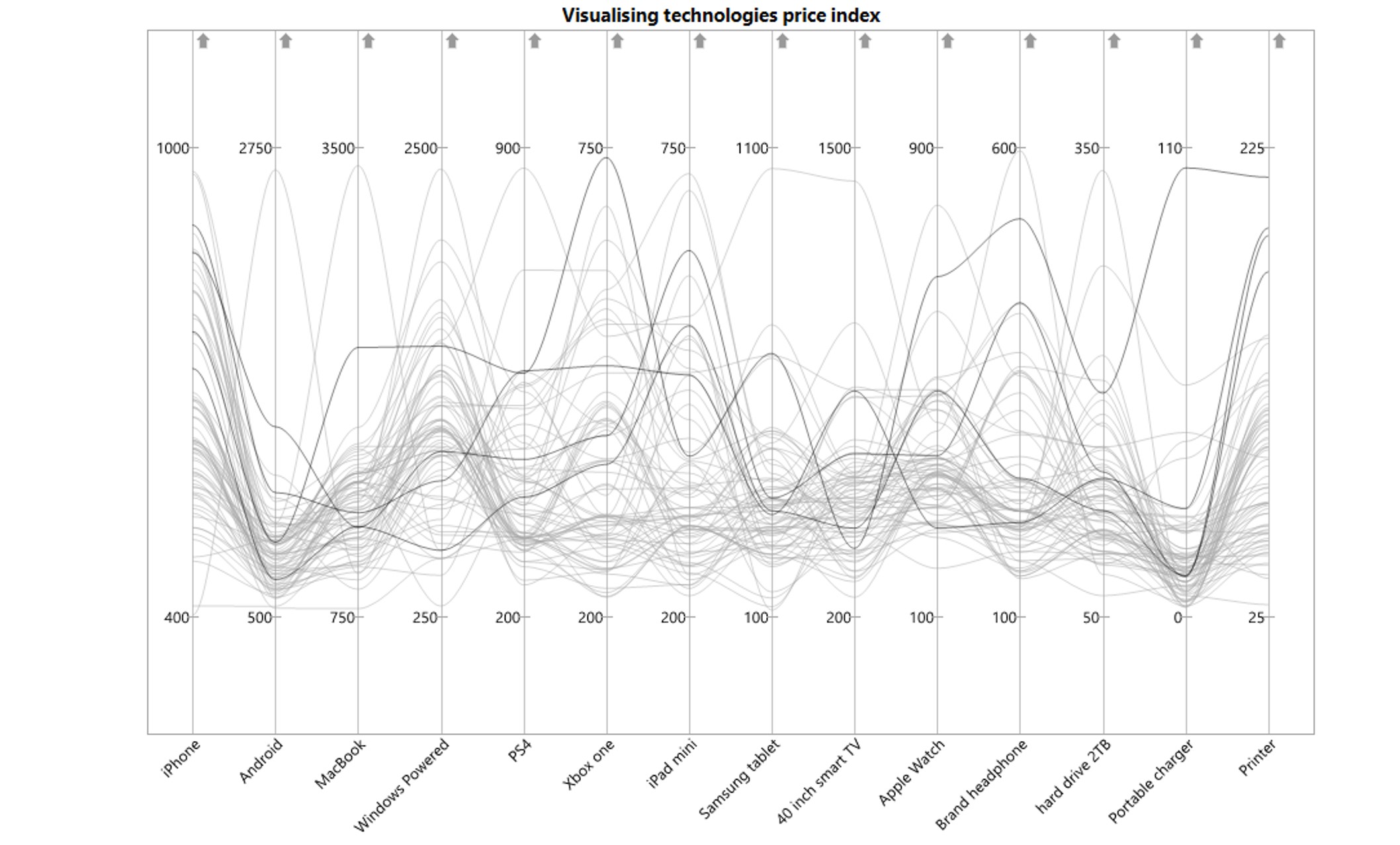
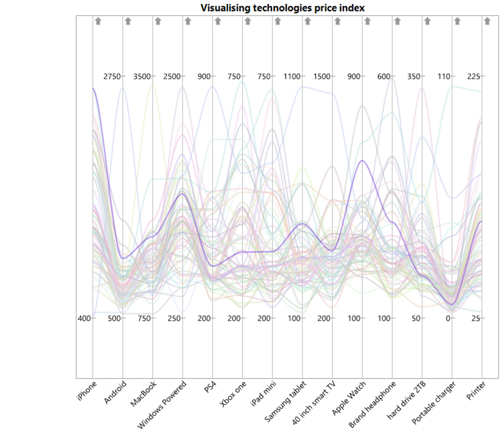
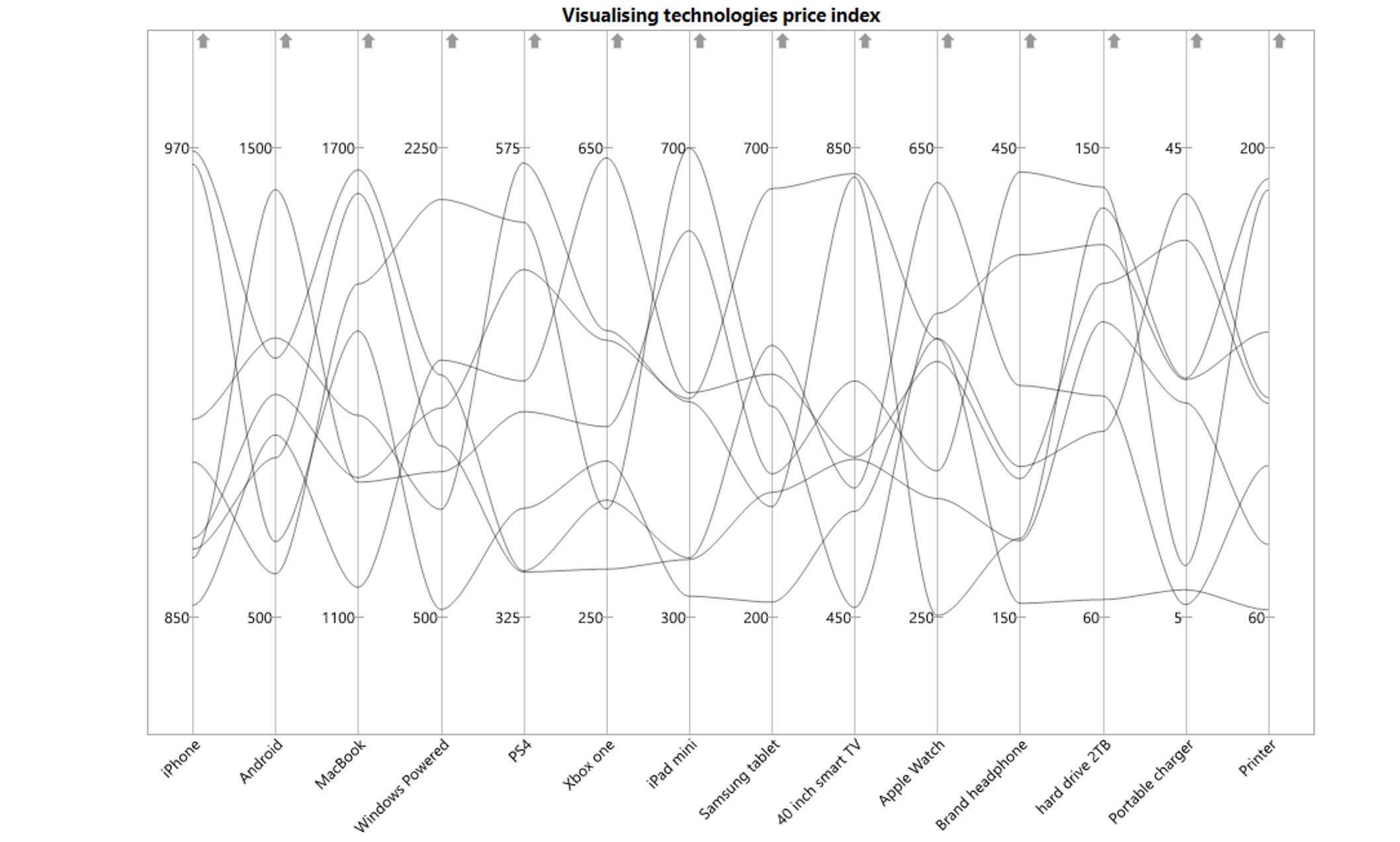
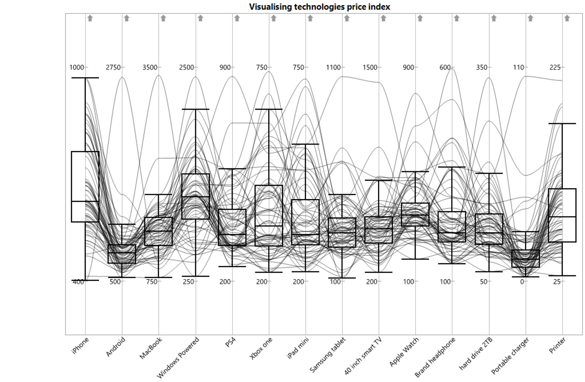
  • Visual analytics techniques and tools for visualising and analysing multidimensional continuous data
  • Visual analytics techniques and tools for visualising and analysing multidimensional categorical data
  • Sensing both categorical and continuous multidimensional data
  • Multidimensional data analysis best practices

Visual analytics techniques

  • Scatterplot Matrix
  • Ternary plot
  • Glyphs
  • Parallel coordinates
  • Heatmap

Introducing Multidimensional Data

Wine data set

There are 13 variables in this data set. 11 of them are in continuous data type, one in ordinal scale and one in nominal scale.

fixed acidity volatile acidity citric acid residual sugar chlorides free sulfur dioxide total sulfur dioxide density pH sulphates alcohol quality type
7.4 0.70 0.00 1.9 0.076 11 34 0.9978 3.51 0.56 9.4 5 red
7.8 0.88 0.00 2.6 0.098 25 67 0.9968 3.20 0.68 9.8 5 red
7.8 0.76 0.04 2.3 0.092 15 54 0.9970 3.26 0.65 9.8 5 red
11.2 0.28 0.56 1.9 0.075 17 60 0.9980 3.16 0.58 9.8 6 red
7.4 0.70 0.00 1.9 0.076 11 34 0.9978 3.51 0.56 9.4 5 red
7.4 0.66 0.00 1.8 0.075 13 40 0.9978 3.51 0.56 9.4 5 red

Source: UCI Machine Learning Repository

Scatterplot Matrix

  • Scatterplot matrix (also known as correlation matrix) is a graphical method used to reveal the relationship between multiple variables pairwisely.

Scatterplot Matrix: Problem with large data

Correlogram

  • Correlogram uses visual geometrics such as ellipse, circle, square, and bars to replace the scatterplot in correlation matrix.

  • It is very useful to reveal pair-relationships between variables in a large correlation matrix.

  • In this plot, correlation coefficients is colored according to the value.

Visual abstractions for rendering correlation values.

corrgram package

  • The corrgram is one of the oldest R package specially designed to correlograms. You can choose what to display in the upper, lower and diagonal part of the figure: scatterplot, pie chart, text, ellipse and more.

ggstatsplot package

Corrplot package

Multivariate data with both continuous and categorical variables

ID CLASS TYPE GENDER RACE ENGLISH MATHS SCIENCE
Student321 3I Male Malay 21 9 15
Student305 3I Female Malay 24 22 16
Student289 3H Male Chinese 26 16 16
Student227 3F Male Chinese 27 77 31
Student318 3I Male Malay 27 11 25
Student306 3I Female Malay 31 16 16

Correlogram: GGally Package

  • The GGally package offers great options to build correlograms.

  • The ggpairs() function build a classic correlogram with scatterplot, correlation coefficient and variable distribution. On top of that, it is possible to inject ggplot2 code, for instance to color categories.

  • Visit this link to learn more about Generalised Pairs Plot

Generalised Pairs Plot

Beyond Visualising Variables Pairwisely

The data

Ternary Plot

  • A ternary plot (also known as ternary graph, triangle plot, simplex plot, Gibbs triangle or de Finetti diagram) is a barycentric plot on three variables which sum to a constant, usually in percentage.

  • It graphically depicts the ratios of the three variables as positions in an equilateral triangle.

ggtern package

  • ggtern is a package that extends the functionality of ggplot2, giving the capability to plot ternary diagrams for (subset of) the ggplot2 proto geometries.

  • For a good start, please refer to the article entitle ggtern: Ternary Diagrams Using ggplot2

Glyphs

  • Star plot (Chambers 1983)(also known as radar chart, star chart and spider chart) is a method of displaying multivariate data.
  • The star plot consists of a sequence of equi-angular spokes, called radii, with each spoke representing one of the variables. The data length of a spoke is proportional to the magnitude of the variable for the data point relative to the maximum magnitude of the variable across all data points. A line is drawn connecting the data values for each spoke. This gives the plot a star-like appearance and the origin of the name of this plot.

Multiple Glyphs Chart

Glyphs Chart in R

  • In R, radarchart() of fmsb library is the best tool to build radar chart.

Visualising and Analysing Multivariate Data: Heatmap method

  • A heat map (or heatmap) is a graphical representation of data where the individual values contained in a matrix are represented as colors.

R packages for creating statis Heatmap

There are many R packages and functions can be used to drawing static heatmaps, they are:

  • heatmap()of R stats package. It draws a simple heatmap.
  • heatmap.2() of gplots R package. It draws an enhanced heatmap compared to the R base function.
  • pheatmap() of pheatmap R package. pheatmap package also known as Pretty Heatmap. The package provides functions to draws pretty heatmaps and provides more control to change the appearance of heatmaps.
  • ComplexHeatmap package of R/Bioconductor package. The package draws, annotates and arranges complex heatmaps (very useful for genomic data analysis). The full reference guide of the package is available here.
  • superheat package: A Graphical Tool for Exploring Complex Datasets Using Heatmaps. A system for generating extendable and customizable heatmaps for exploring complex datasets, including big data and data with multiple data types. The full reference guide of the package is available here.

R package for creating Interactive Heatmap: heatmaply package

  • heatmaply is an R package for building interactive cluster heatmap that can be shared online as a stand-alone HTML file. It is designed and maintained by Tal Galili.

  • Before we get started, you should review the Introduction to Heatmaply to have an overall understanding of the features and functions of Heatmaply package. You are also required to have the user manualof the package handy with you for reference purposes.

:scale 85%

Visualising and Analysing Multivariate Data

Parallel Coordinates Plot Method

Parallel Coordinates plot or Parallel plot allows to compare the feature of several individual observations on a set of numeric variables.

Parallel Coordinates: Brushing

Parallel Coordinates: Colour and Highlighting

Parallel Coordinates: Filtering

Parallel Coordinates and boxplot

Static Parallel Coordinates Plot in R

  • ggparcoord() is a function of GGally package for plotting static parallel coordinate plots, utilizing the ggplot2 graphics package.

Interactive Parallel Coordinates Plot in R

  • parcoords package creates interactive parallel coordinates charts with this ‘htmlwidget’ wrapper for d3.js, a JavaScript library for manipulating documents based on data and for creating high interactive data visualisation.

Interactive Parallel Coordinates Plot in R

  • parallelPlot is an R package specially designed to plot a parallel coordinates plot by using ‘htmlwidgets’ package and d3.js.

Reference

  • Radar Chart.
  • Ternary plot, this and this.
  • Friendly, M (2002) “Corrgrams: Exploratory Displays for Correlation Matrices” The American Statistician, Vol. 56, No. 4, pp. 316-324.