Lesson 2: Designing Graphs to Enlighten
20 May 2025
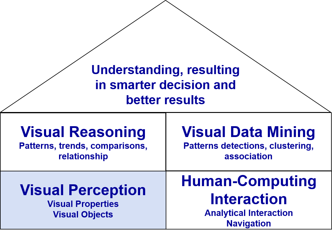
Building Block of Visual Analytics
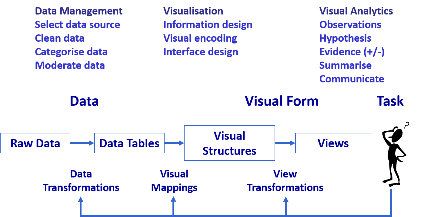
DataViz design process: Start with a clear message
The Devil is in the Data
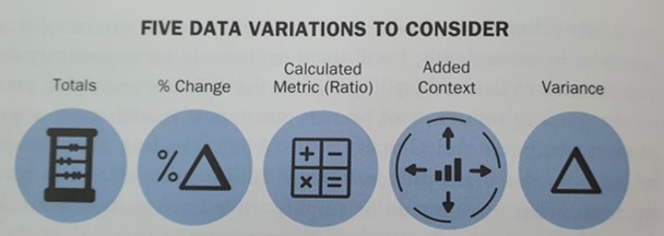
Numbers Worth Knowing
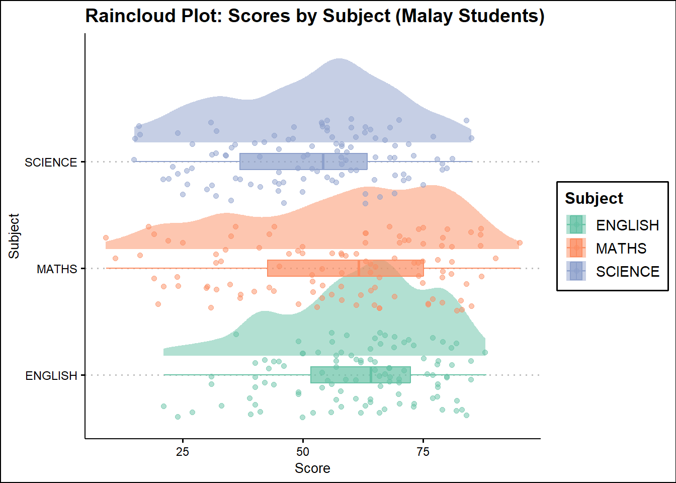
Not all numerical data are continuous!
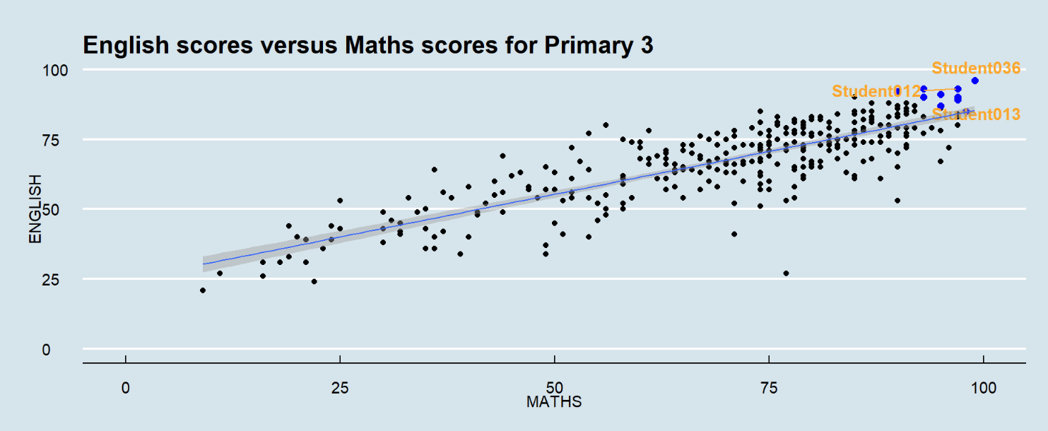
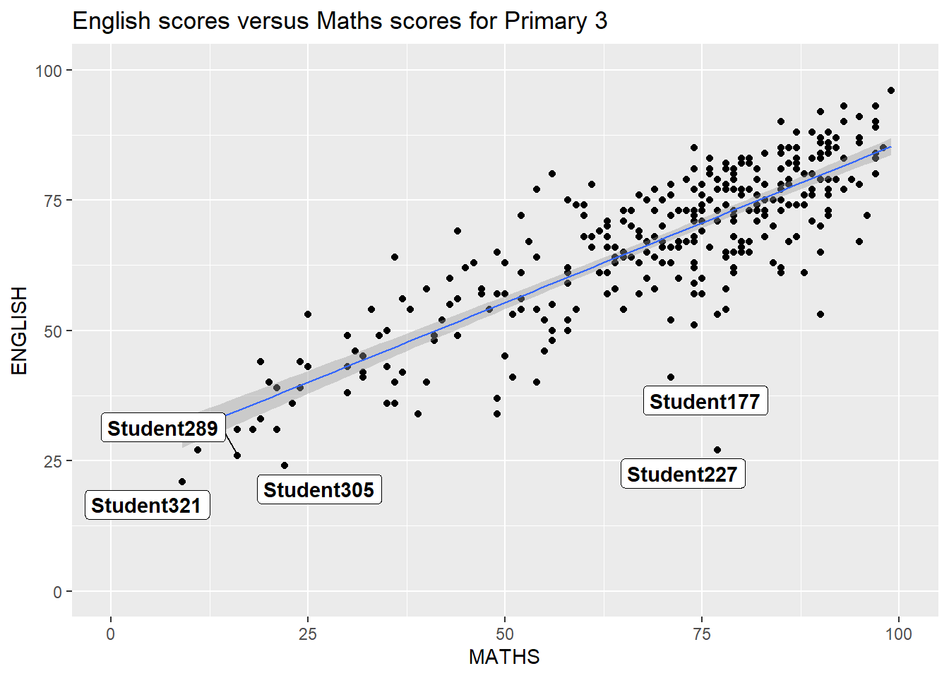
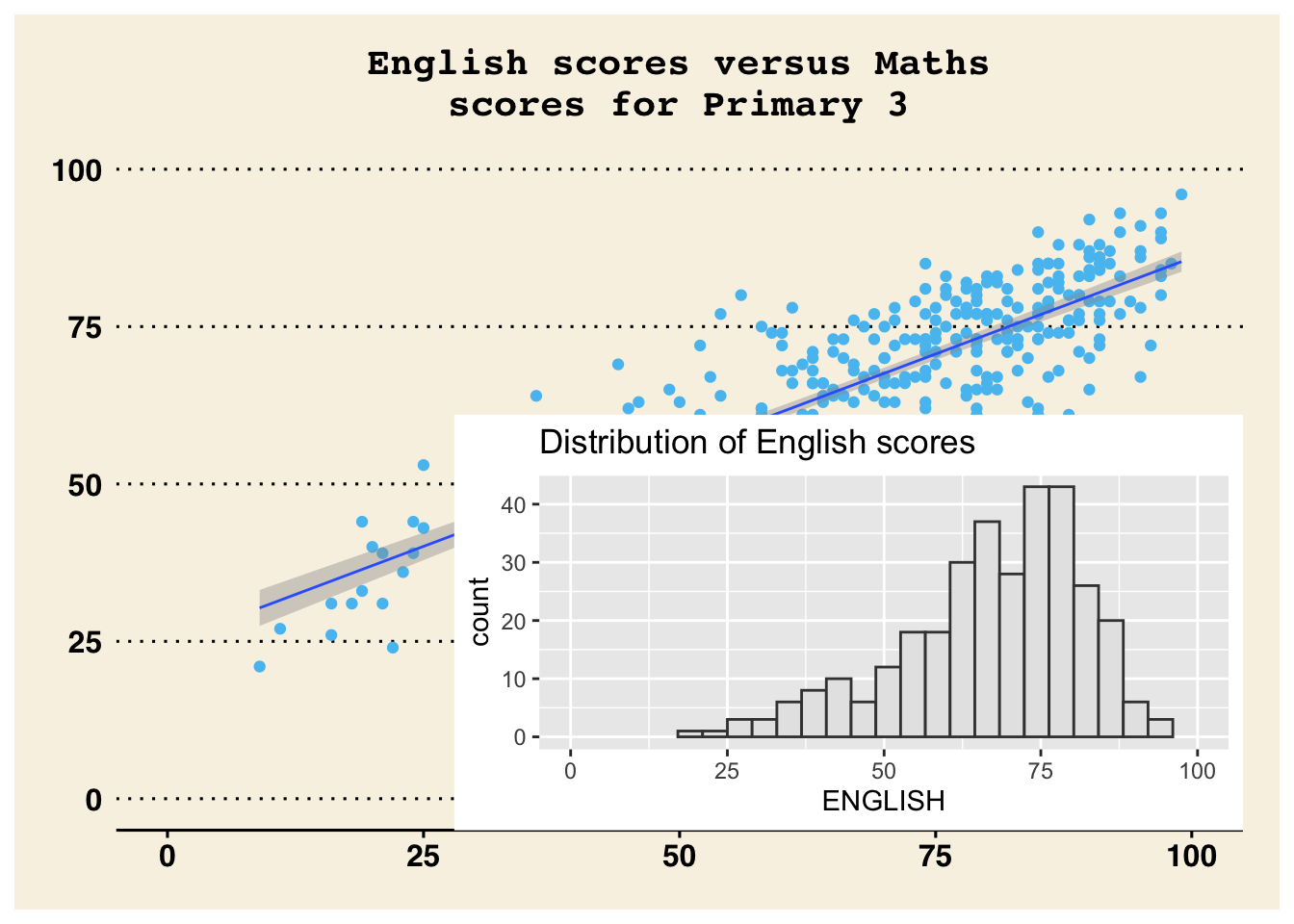
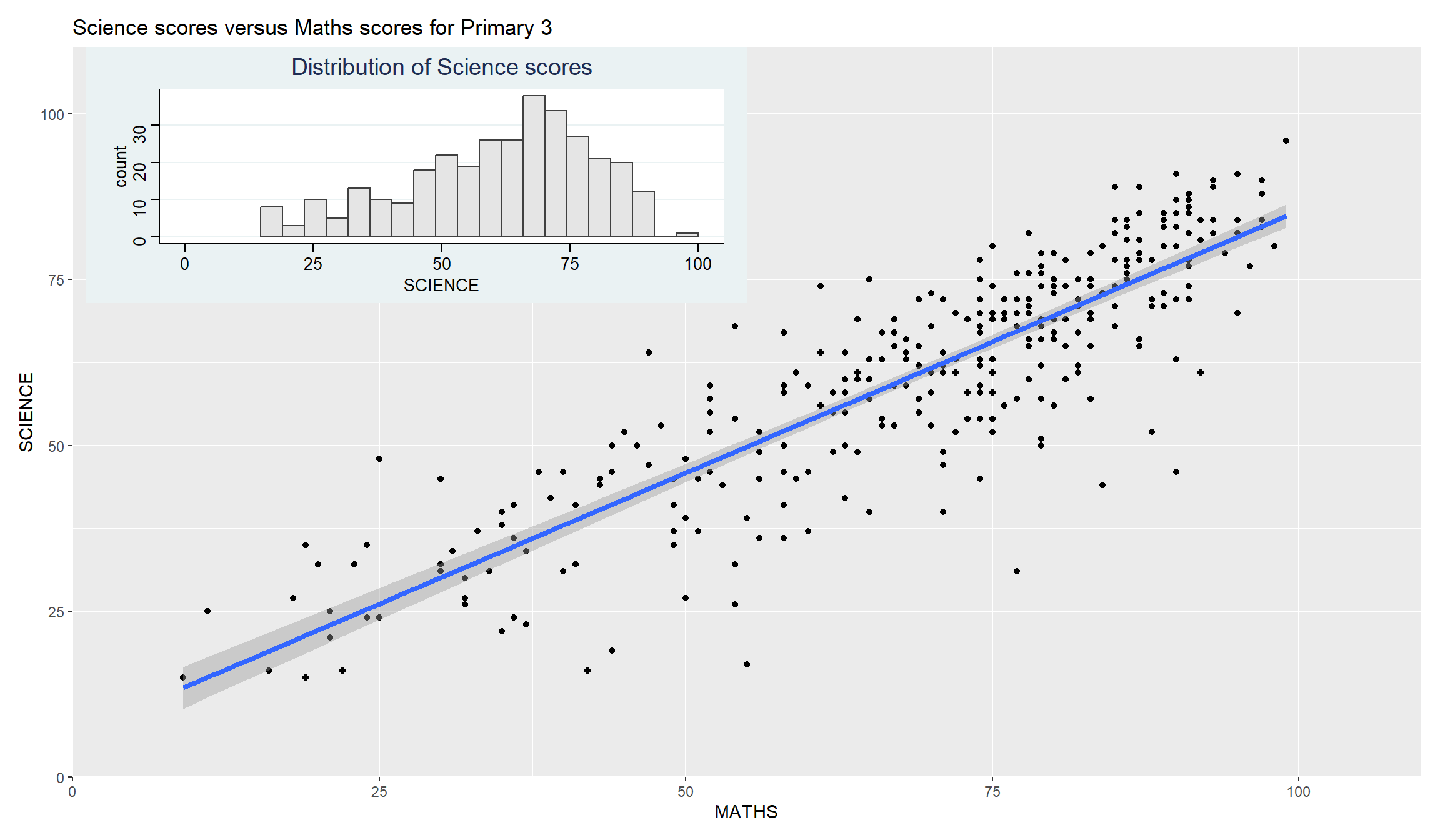
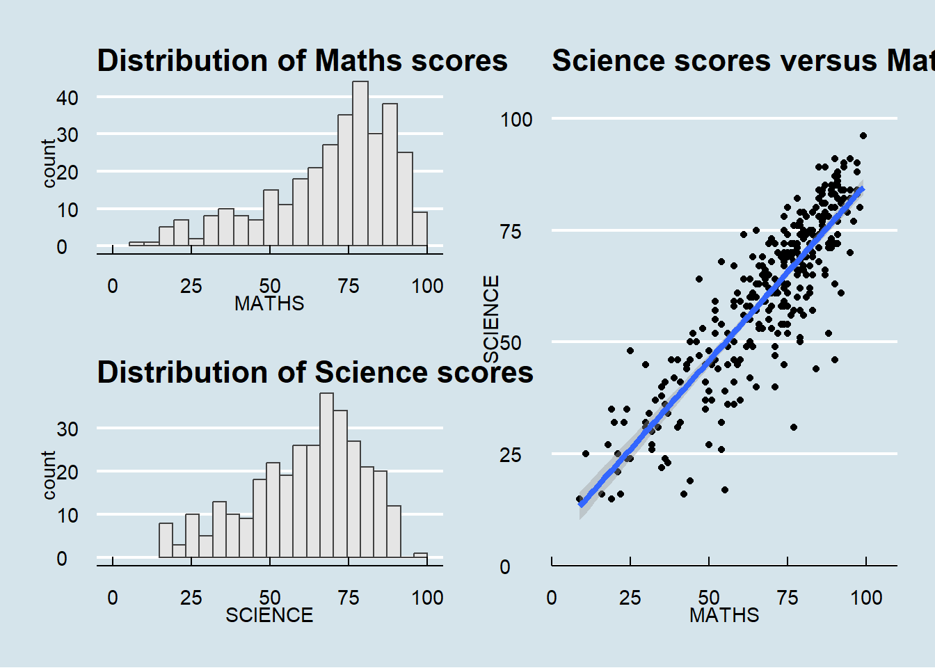
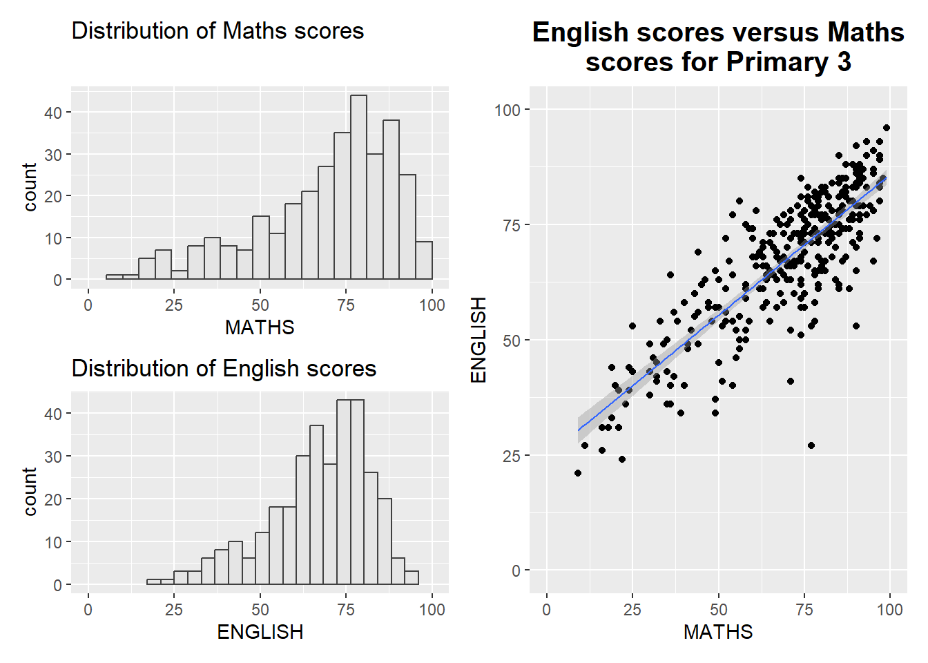
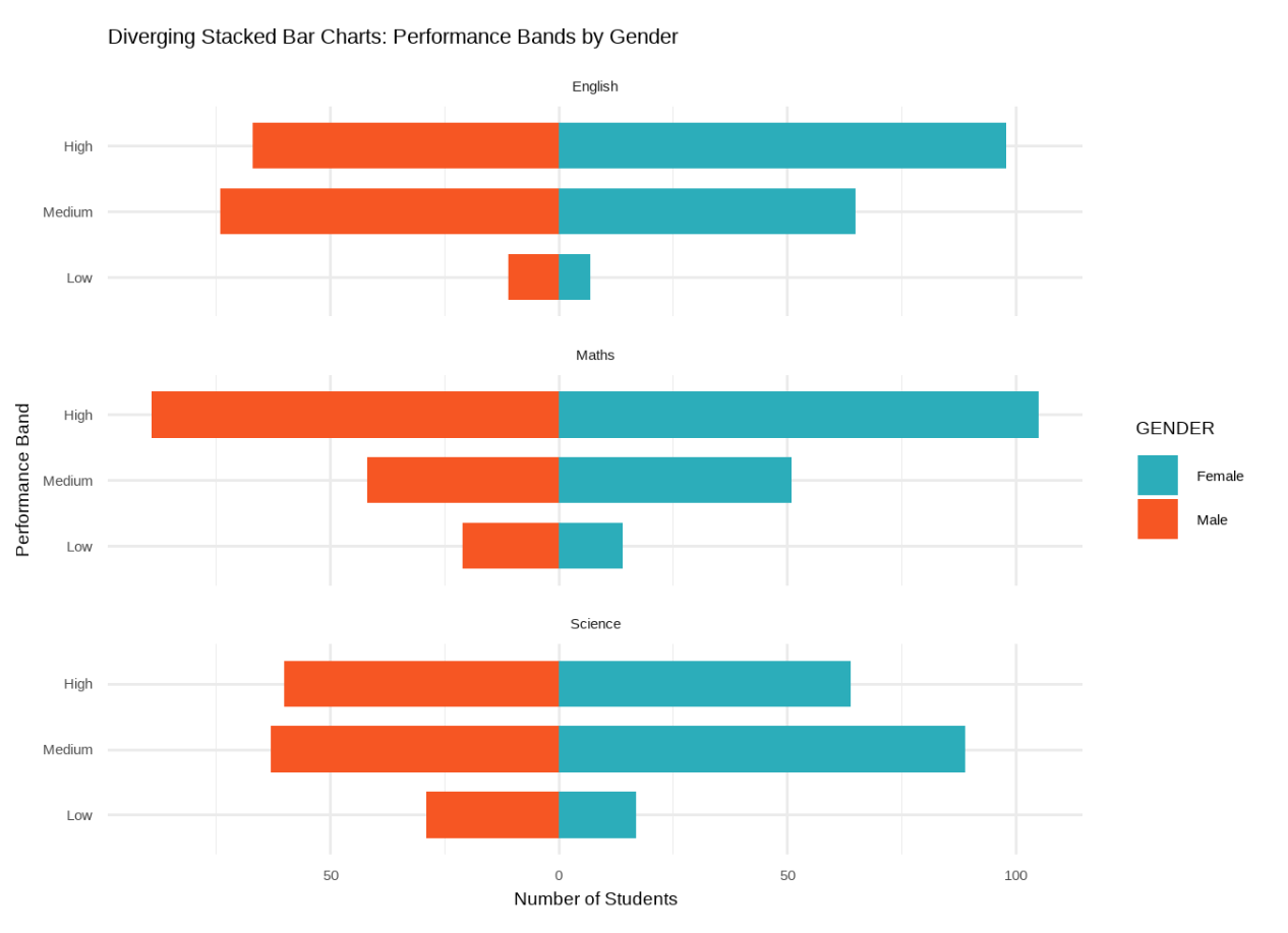
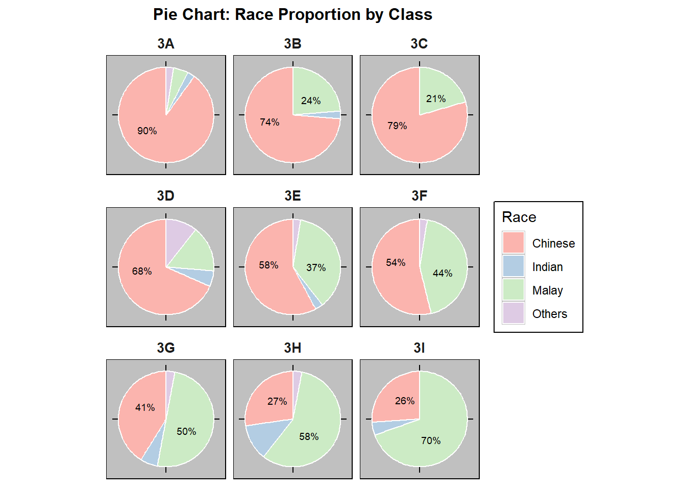
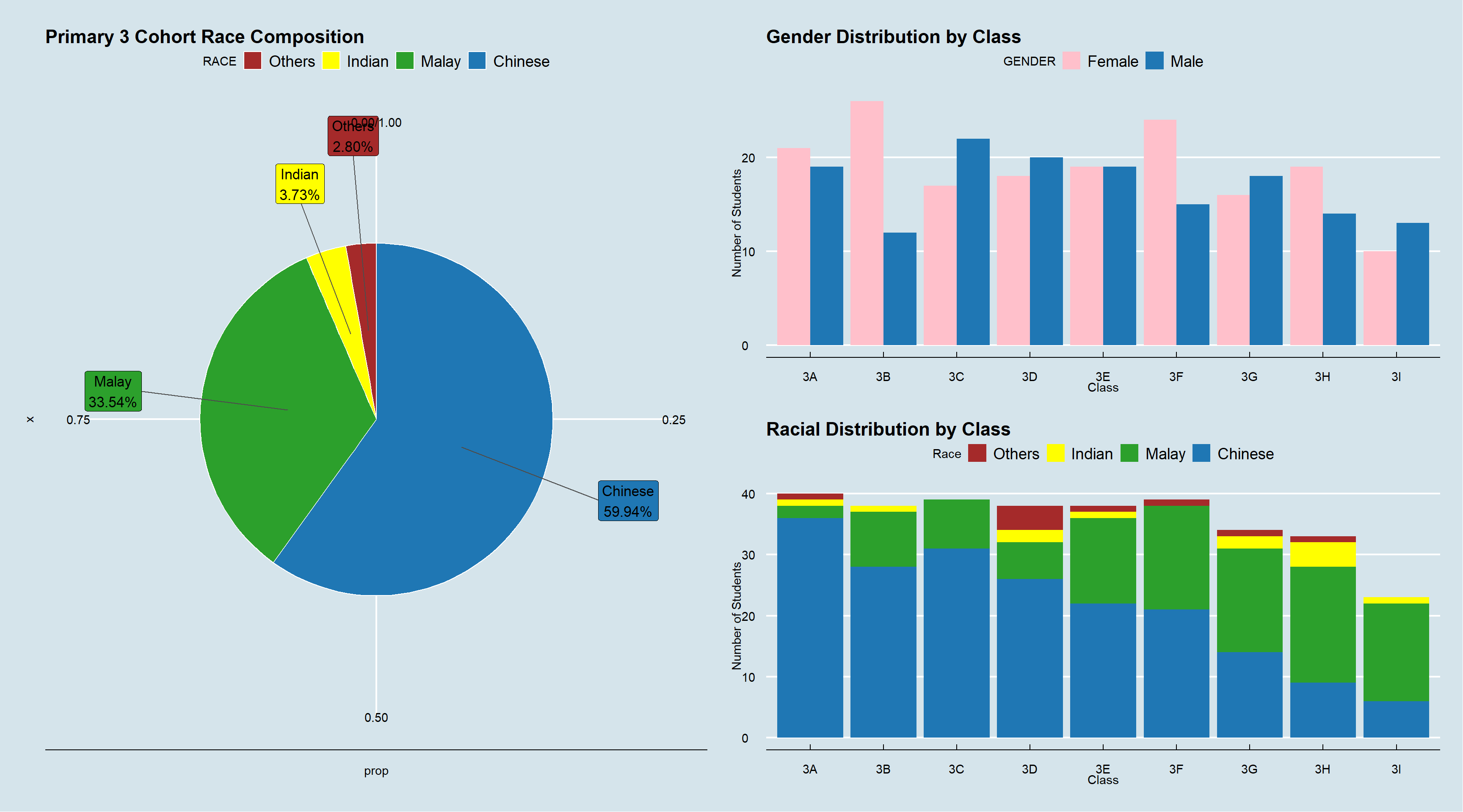
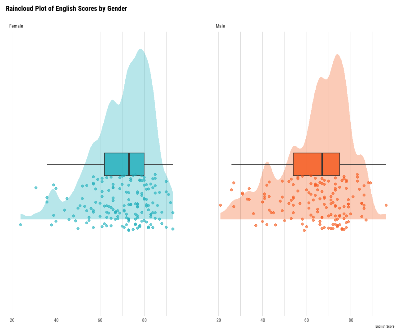
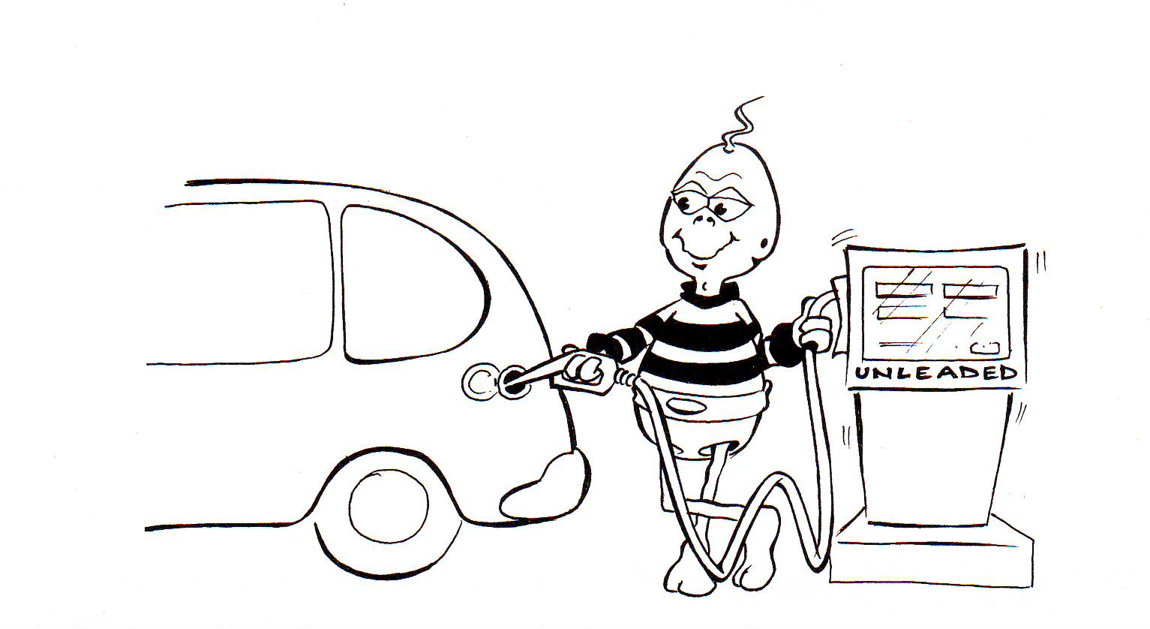
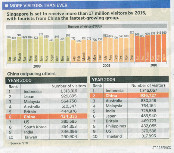
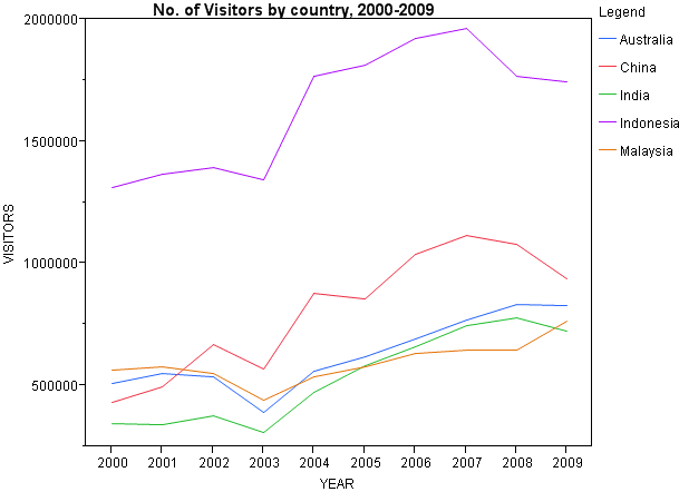
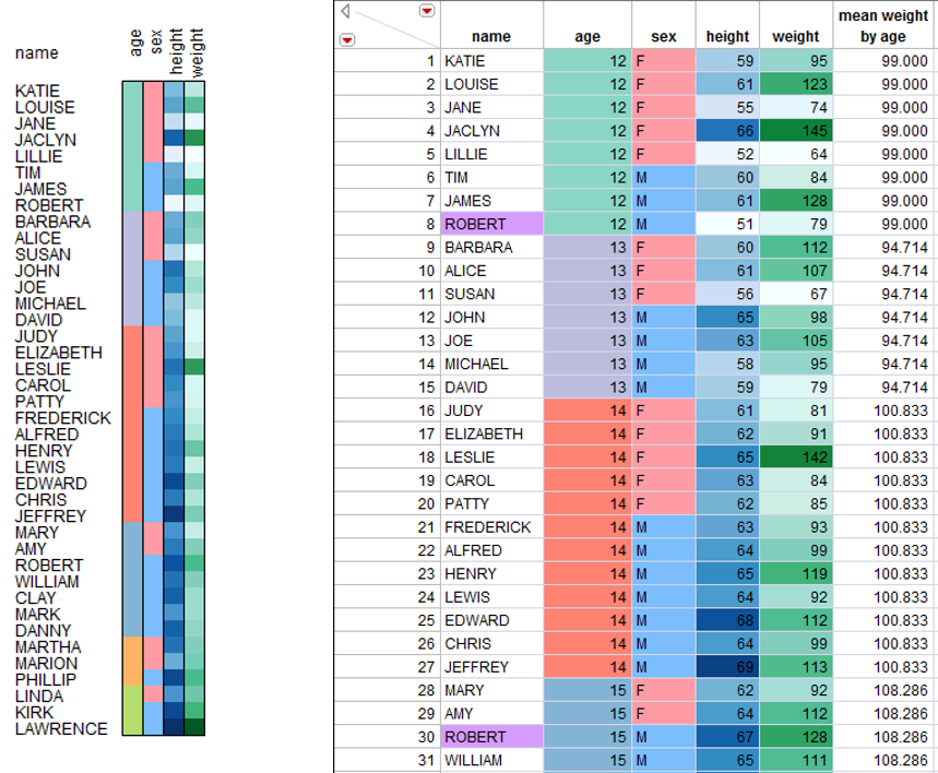
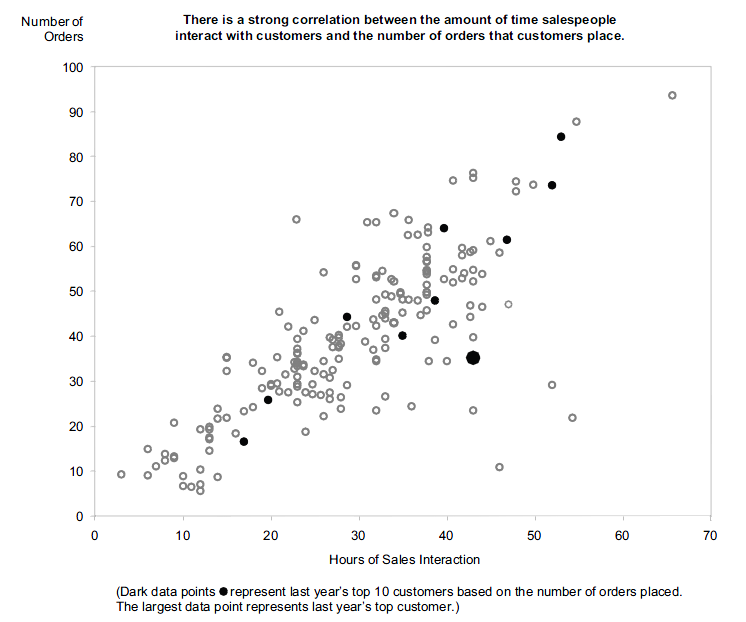
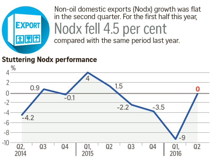
Visualising the Right Data
- There are more than one way to present the data.
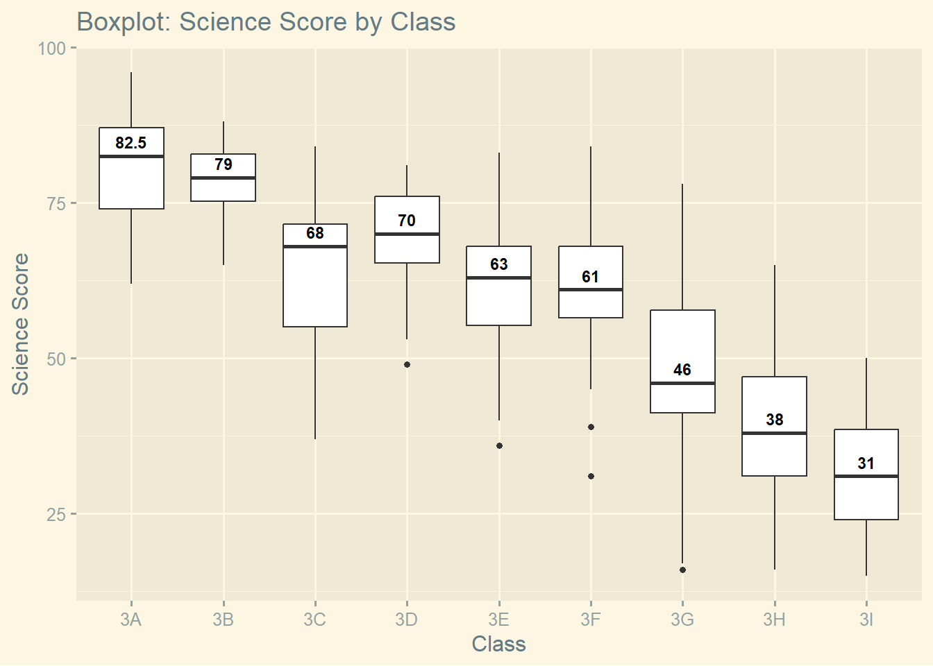
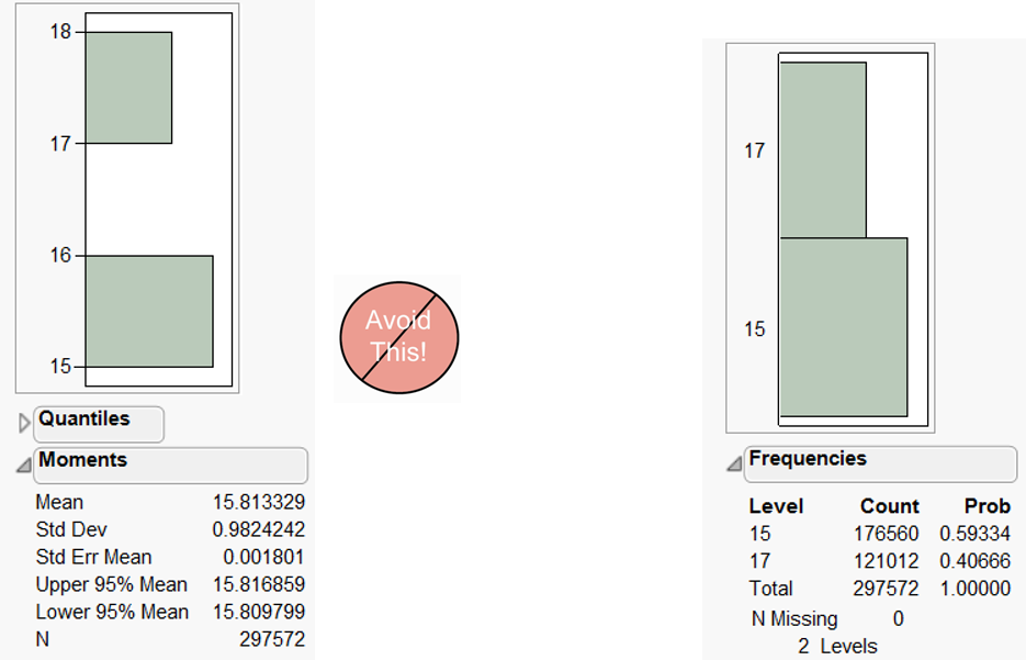
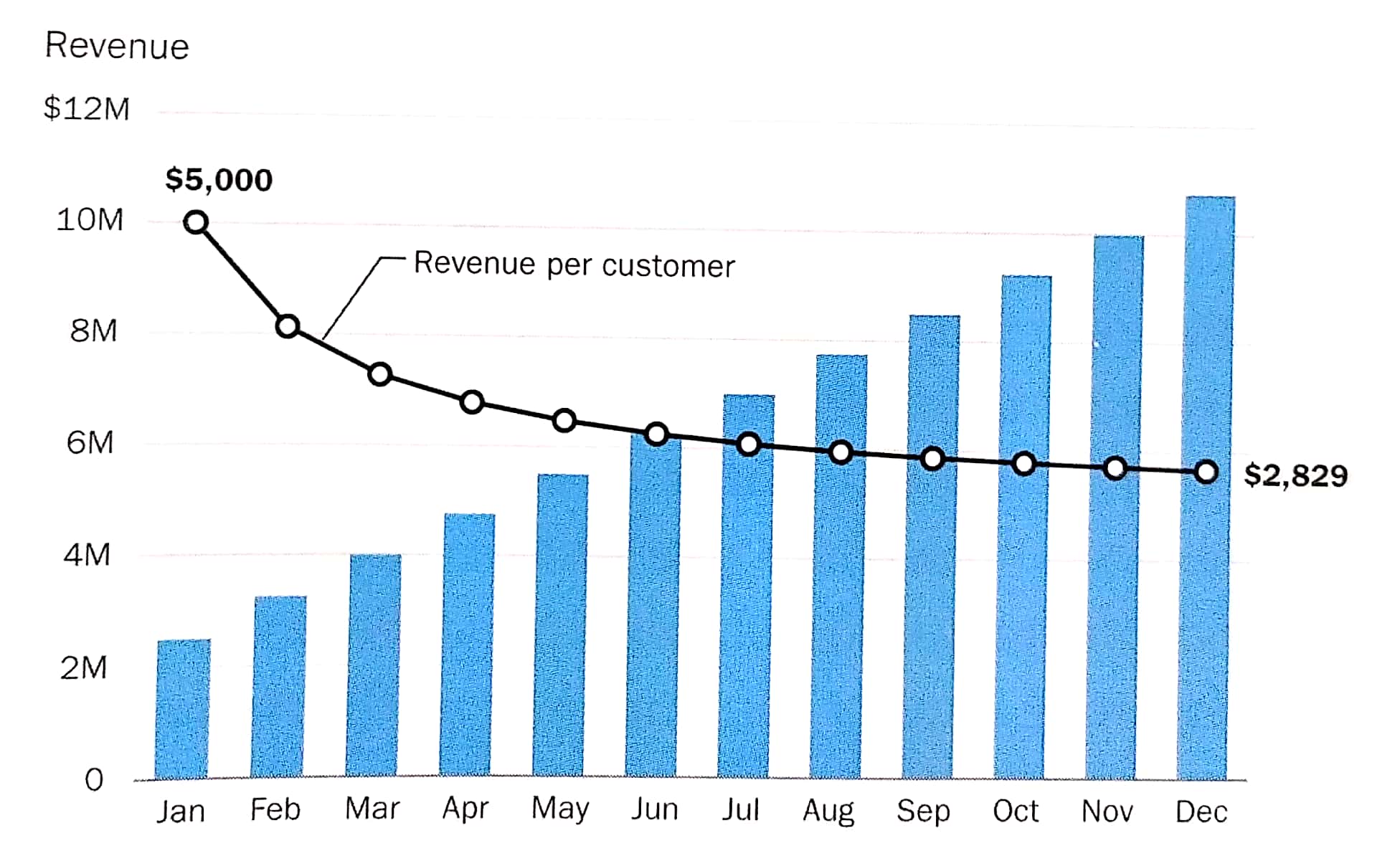
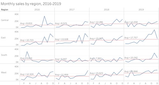
Visualising the Right Data
- Derived values reveal more interesting patterns than absolute values.
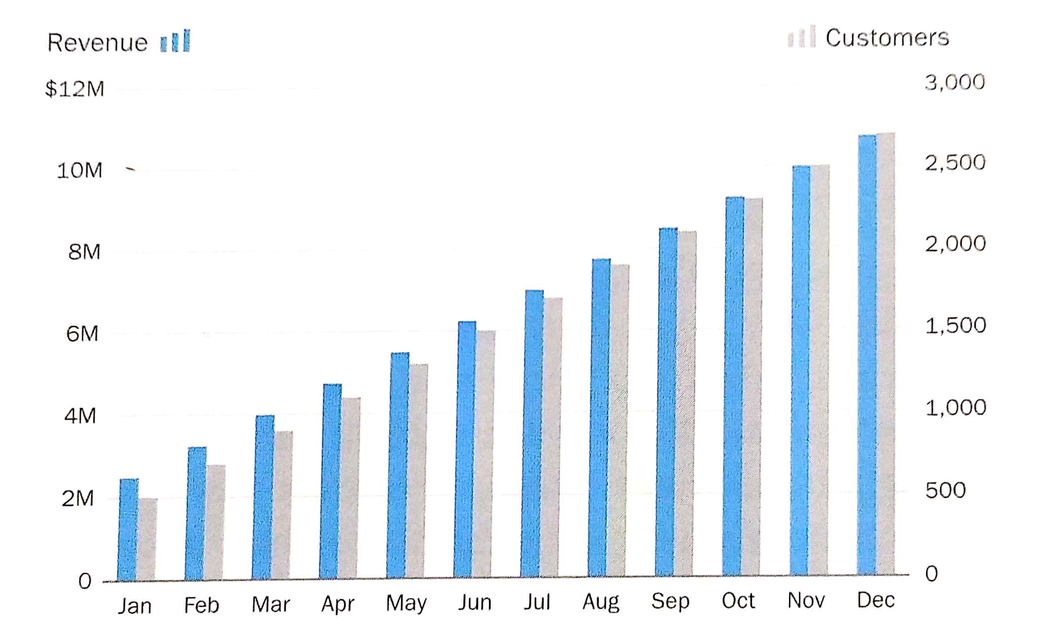
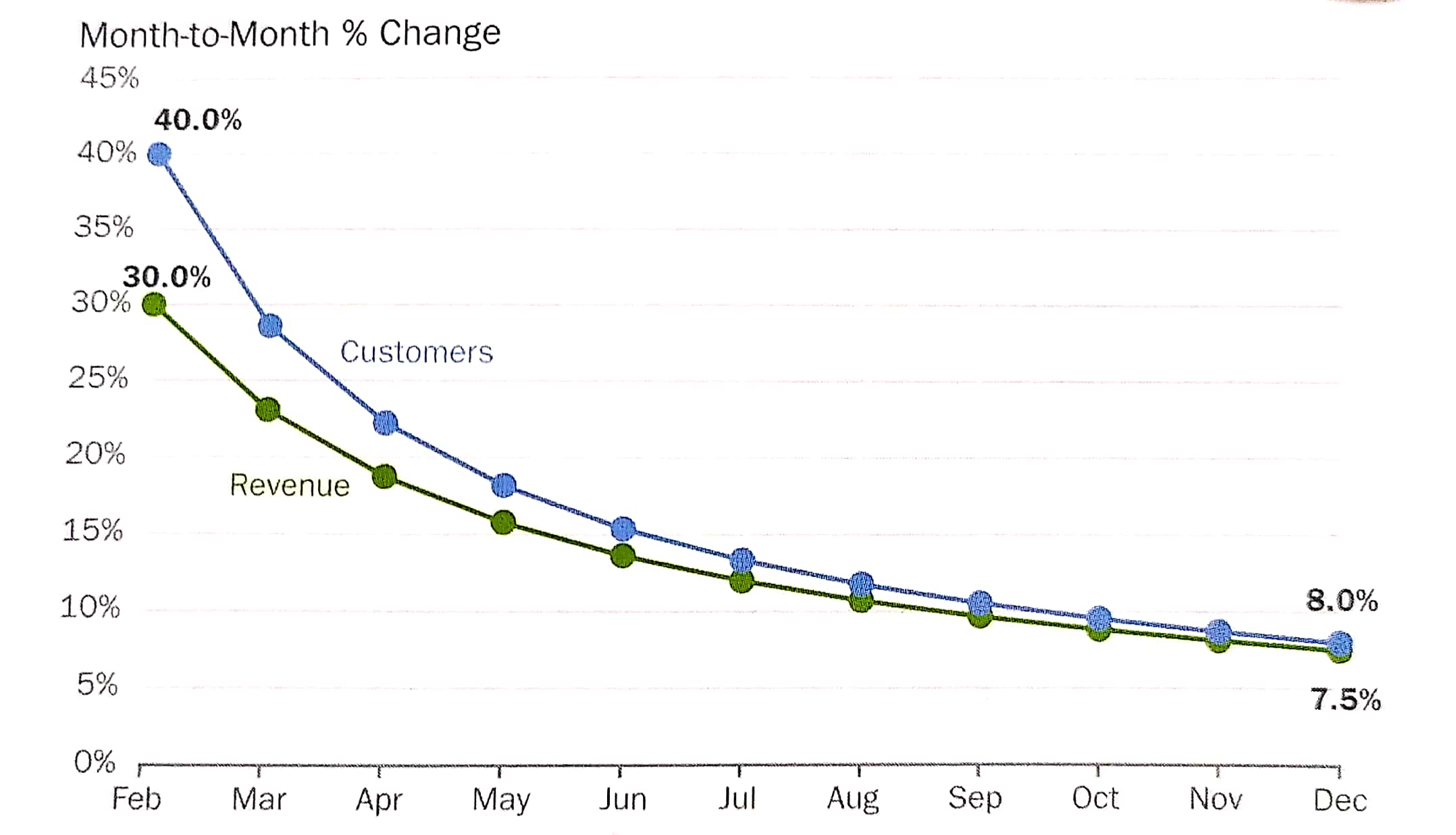
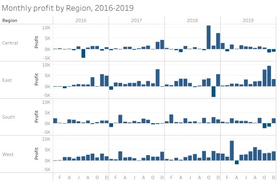
Visualising the Right Data
- Derived values reveal more interesting patterns than absolute values.
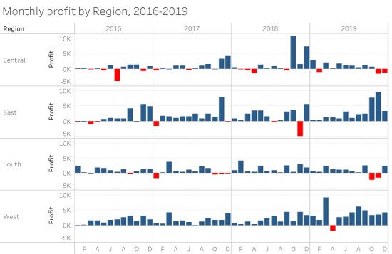
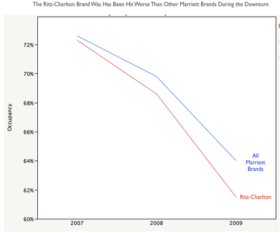
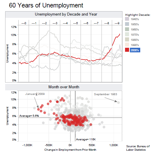
Graphical Integrity: Show Me the Truth
Source: Department of Statistics
Graphical Integrity: Show Me the Truth
Snapshot can be misleading!
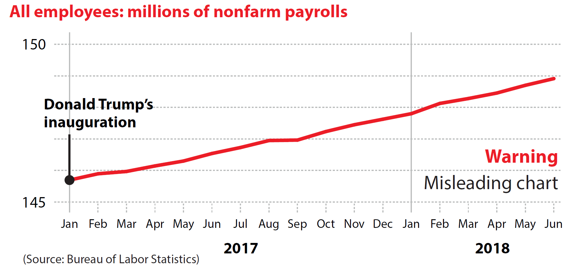
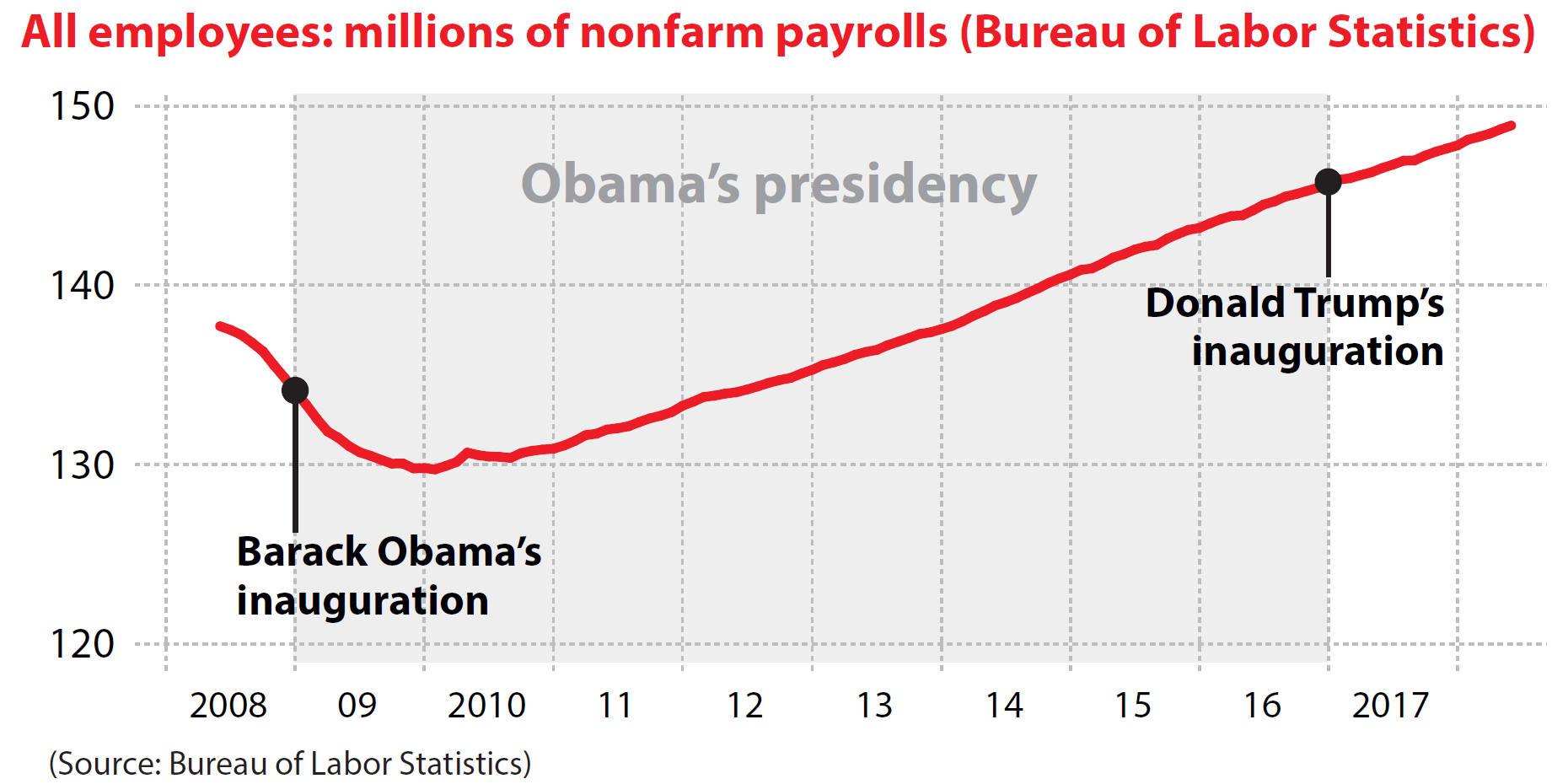
Source: Cairo, Alberto (2019) How Charts Lie, W.W. Norton & Company, USA. pg 168.
Graphical Integrity: Show Me the Truth
Do not miss-out what had happened in between.
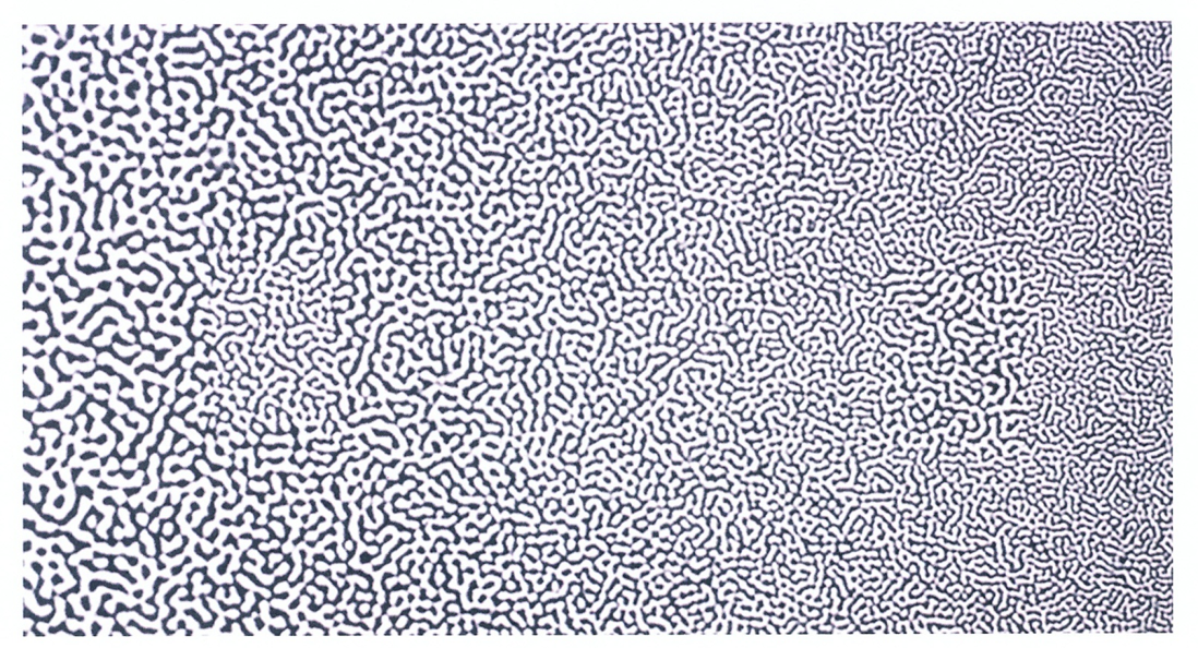
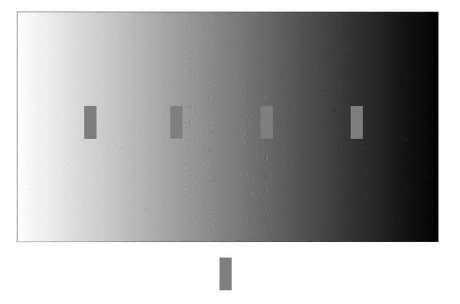
Human Perception and Information Processing
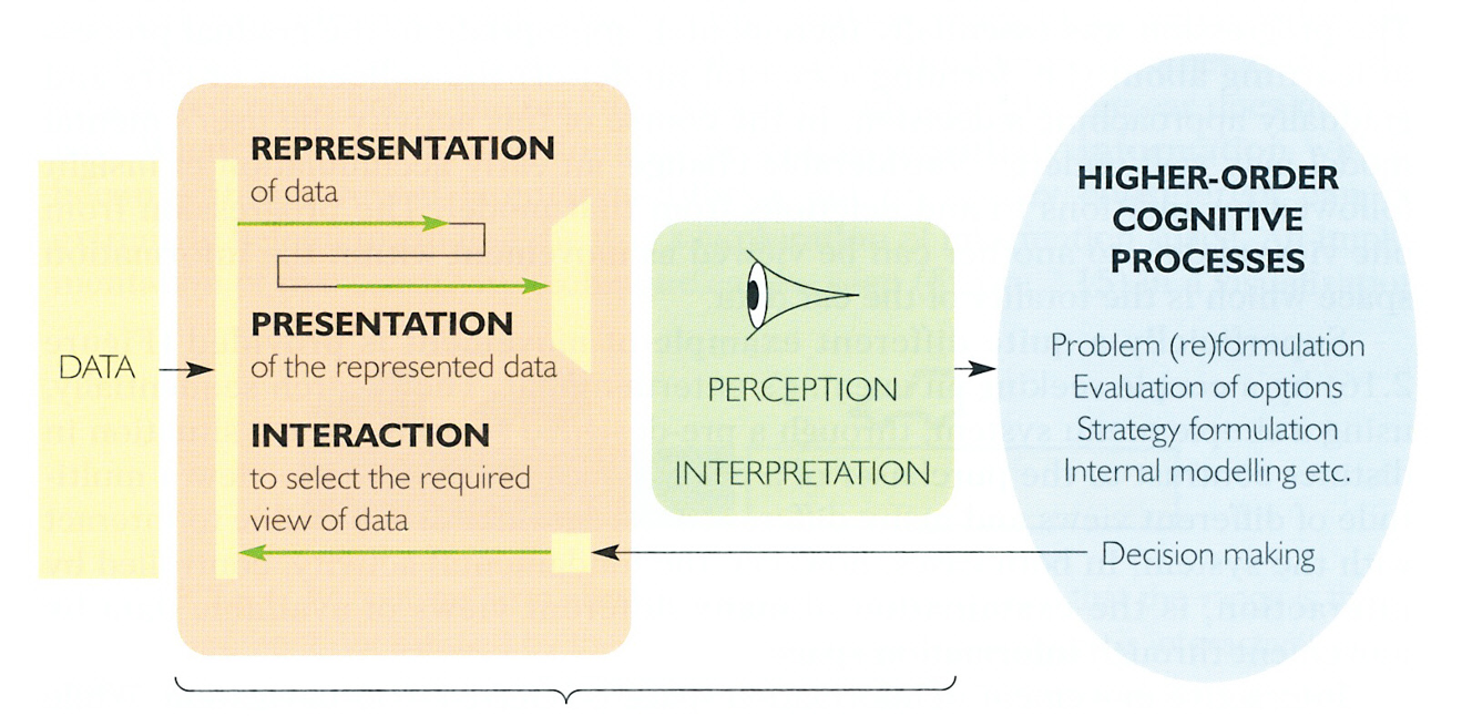
How Visual Sensing Works?
Fact 1:
We see what we know and expect.

How Visual Sensing Works?
Fact 2:
We do not attend to everything we see.
How Visual Sensing Works?
Fact 3:
We don’t remember everything we see.

How Visual Sensing Works?
Fact 3:
We don’t remember everything we see.

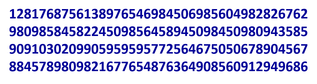
How Visual Sensing Works?
How Many 3’s?
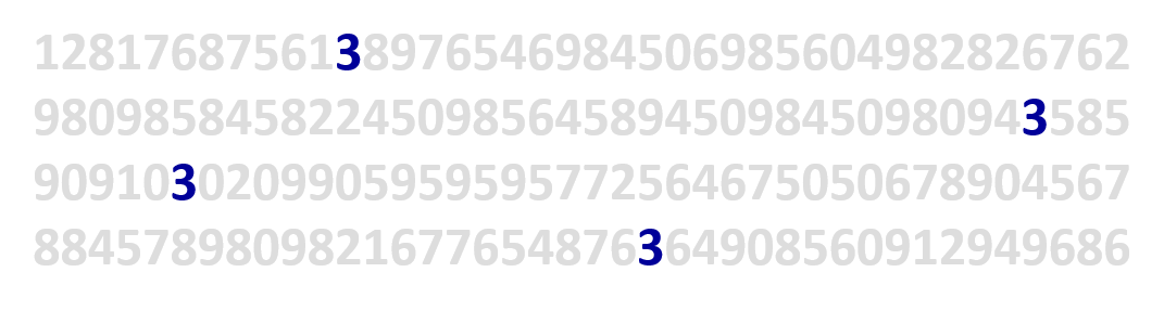
How Visual Sensing Works?
Now you see them!
Application of pre-attentive principle in data visualisation design
Application of pre-attentive principle in data visualisation design
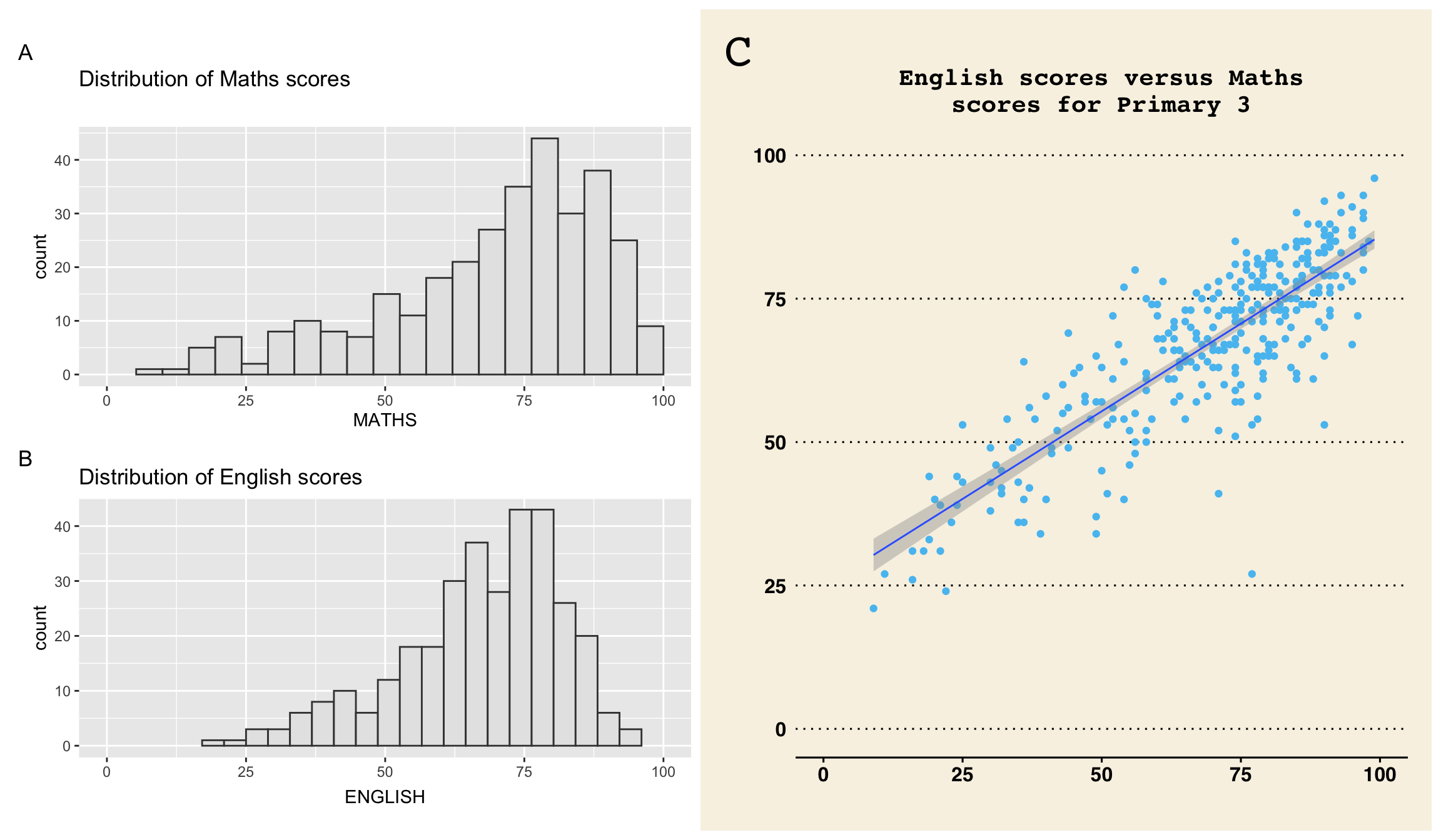
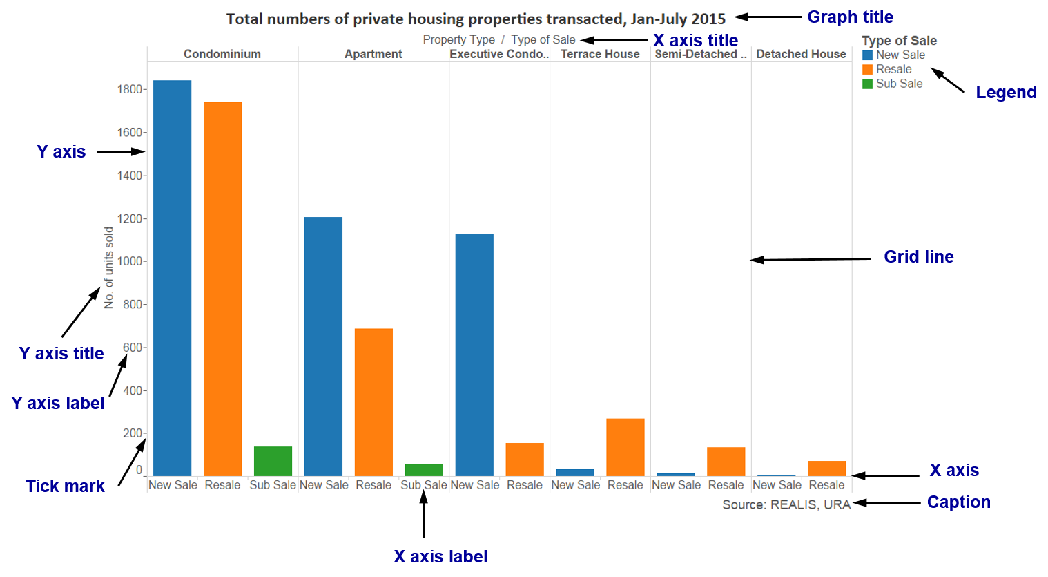
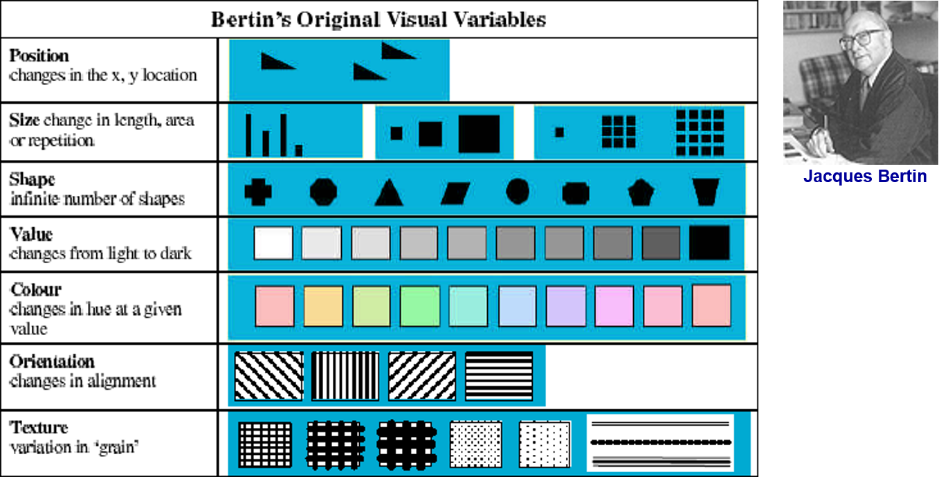
Components of a graph
Bertin’s Semiology of graphics
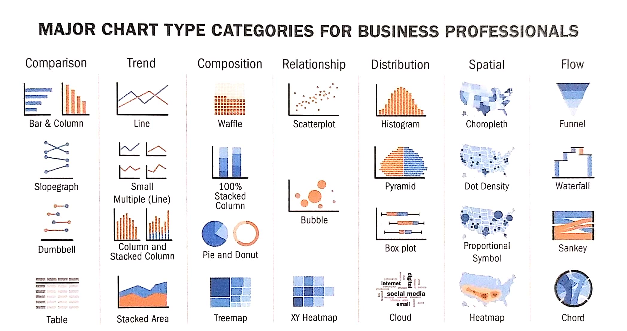
Choosing the Right Visualisation
General Guide: Show the Data Clearly
Guides for Encoding Values in Graph
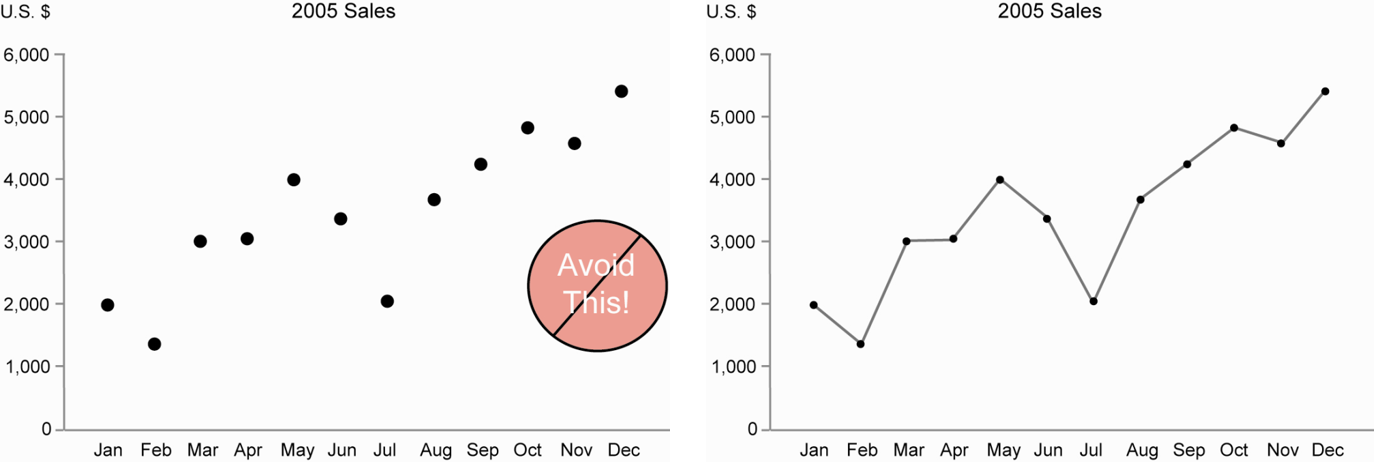
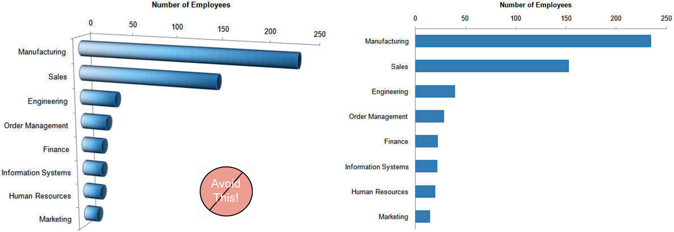
Guide 1:
Avoid using point alone to display time-series data.
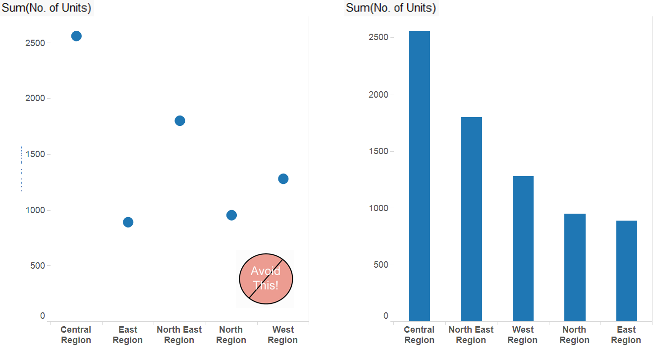
Guides for Encoding Values in Graph
Guide 2:
Avoid using points to represent discrete values
Guides for Encoding Values in Graph
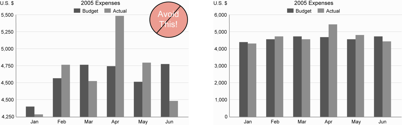
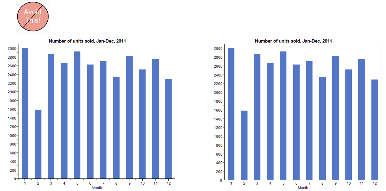
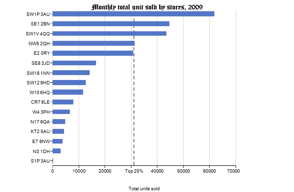
Guide 3:
Bars don’t work unless the quantative scale begins at zero
Guide for Encoding Values in Graph
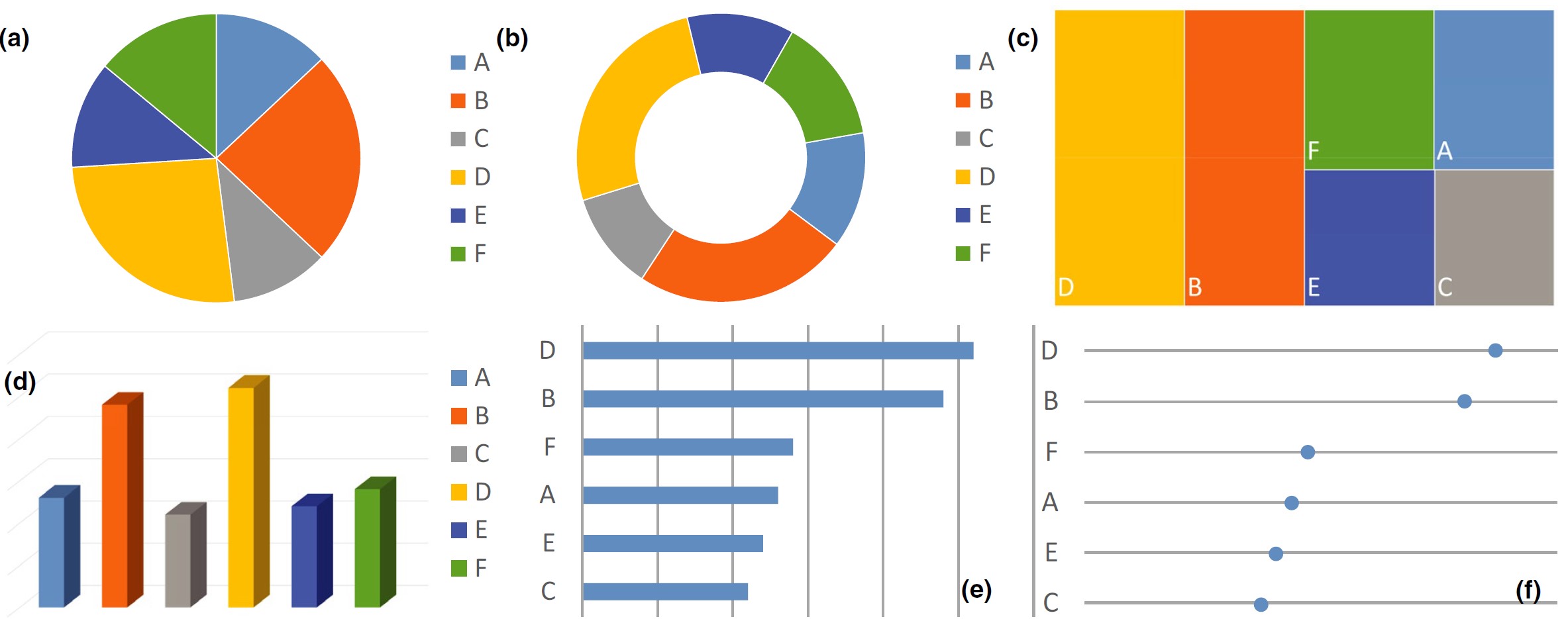
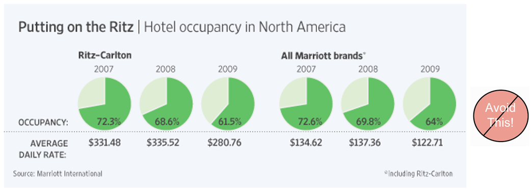
Guide 4:
Avoid pie chart if possible because our eyes are not good in reading areas
Reference: JunkCharts
Guide for Encoding Values in Graph
Guide 5:
Avoid pie chart if you are comparing changes over time
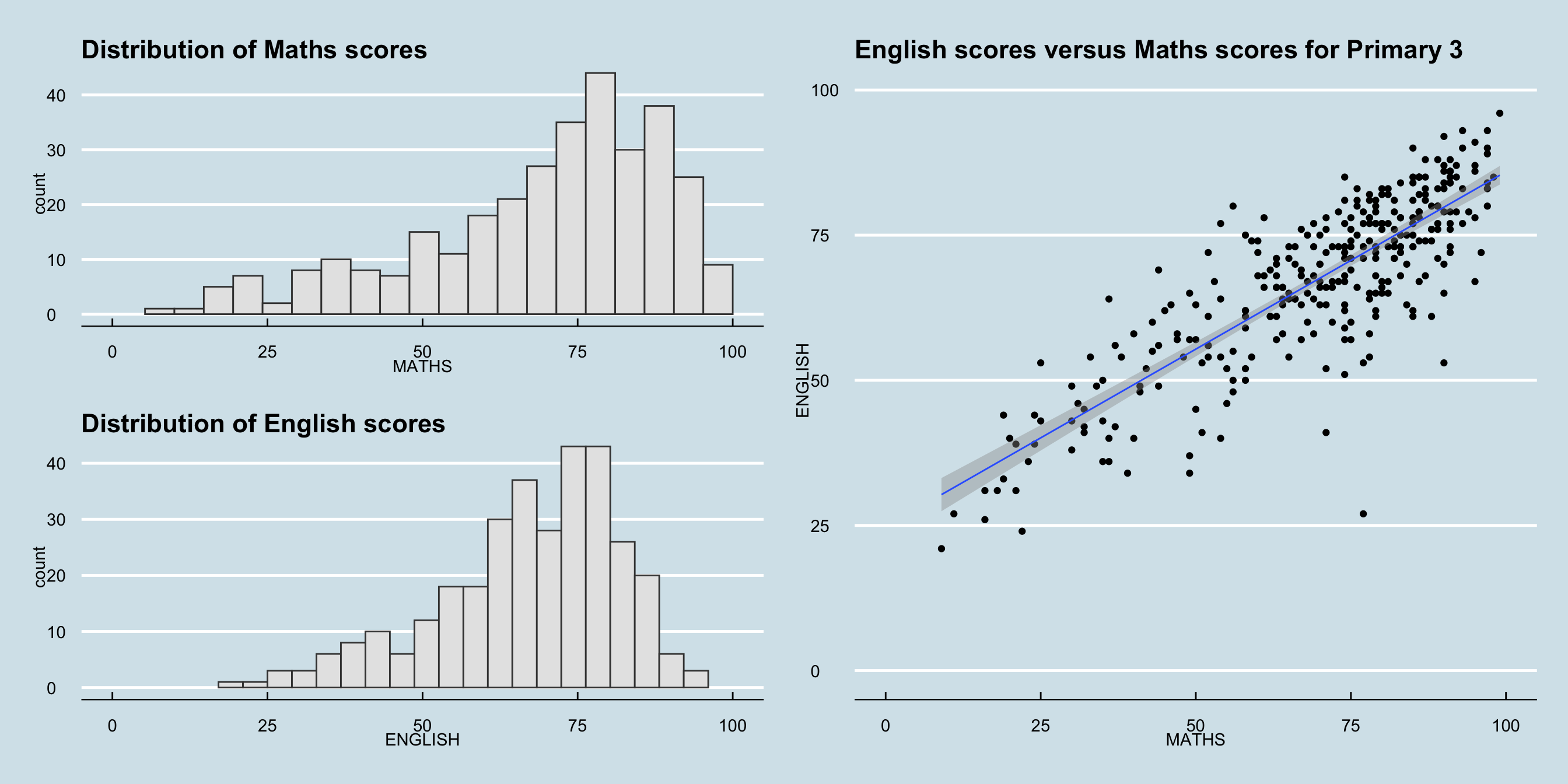
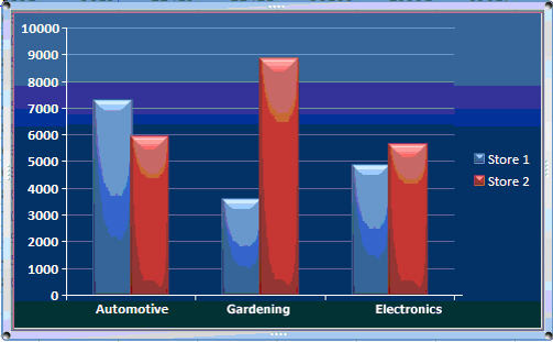
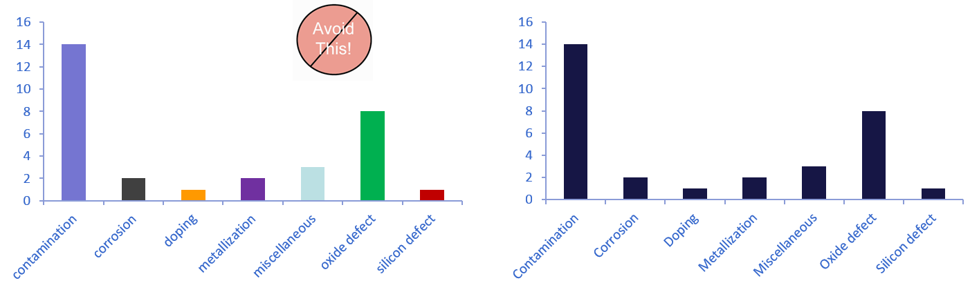
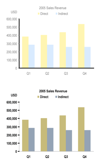
ChartJunk I
Avoid using unnecessary colour shading for the bar.
ChartJunk II
Avoid colourful or wallpaper background.
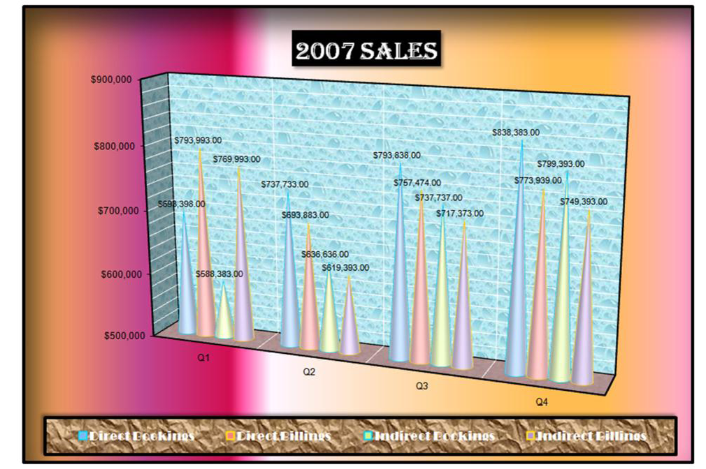
ChartJunk III
Avoid using 3D effects in graphics.
ChartJunk IV
Avoid using misleading graphical representation.
ChartJunk V
Avoid using artistic design which is difficult to visualise.
ChartJunk VI
Designing graph to enlighten people – not to entertain them.
Practical Guides for Using Colour in Charts
Guide 1:
If you want different objects of the same colour in a graph to look the same, make sure that the background- the colour that surrounds them – is consistent.
Practical Guides for Using Colour in Charts
Guide 2:
If you want objects in a graph to be easily seen, use a background colour that constrasts sufficiently with the object.
Practical Guides for Using Colour in Charts
Guide 3:
Use color only when needed to serve a particular communication goal.
Practical Guides for Using Colour in Charts
Guide 4:
Use different colours when they correspond to differences of meaning in the data.
Practical Guides for Using Colour in Charts
Guide 5:
Use soft, natural colours to display most information and bright and/or dark colours to highlight information that requires greater attention.
Practical Guides for Using Colour in Charts
Guide 6:
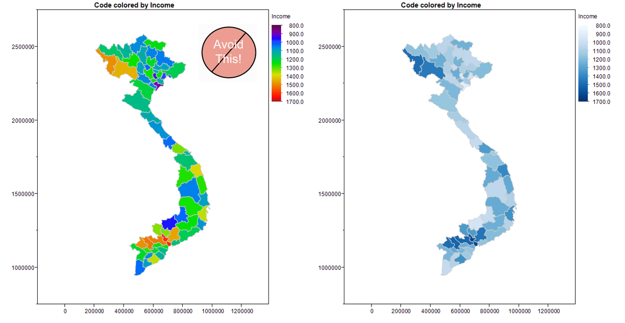
When using colour to encode a sequential range of quantitative values, stick with a single hue (or a small set of closely related hues) and vary intensity from pale colours for low values to increasingly darker and brighter colours for high values.
Practical Guides for Using Colour in Charts
Guide 7:
Non-data components of a graph should be displayed just visibly enough to perform their role, but not more so, for excessive salience could cause them to distract attention from the data.
Practical Guides for Using Colour in Charts
Guide 8:
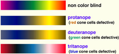
To guarantee that most people who are colourblind can distinguish groups of data that are colour coded, avoid using a combination of red and green in the same display.
Data-ink
- Reduce the non data-ink
- Removed unnecessary non data-ink
- De-emphasise or regularise the remaining non data-ink
- Enhance the data-ink
- Remove unnecessary data-ink
- Emphasise the remaining data-ink
Practical used of data-ink
Shouting to emphasize what’s interesting
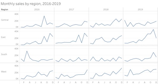
What should the relative lengths of the axis be?
- Should not manipulate the aspect ratio to intentionally exaggerate or downplay the rate of change.
- Stick to the convention of making your graphs wider than being tall.

When can you eliminate tick mark?
Tick marks are superfluous on categorical scale.
When you shouldn’t eliminate tick mark?
Tick marks are necessary on continuous scale.
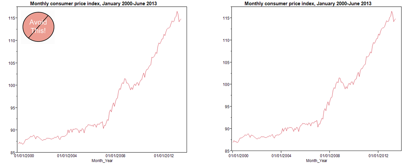
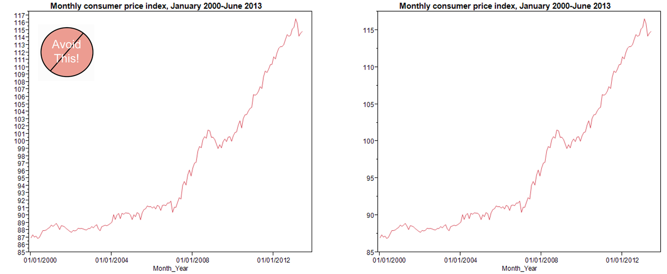
How many tick marks should you use?
- There is no exact number that works best in all circumstances, and the size of the graph is a factor that must considered: the longer the scale line, the more tick marks it should contain.
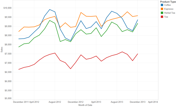
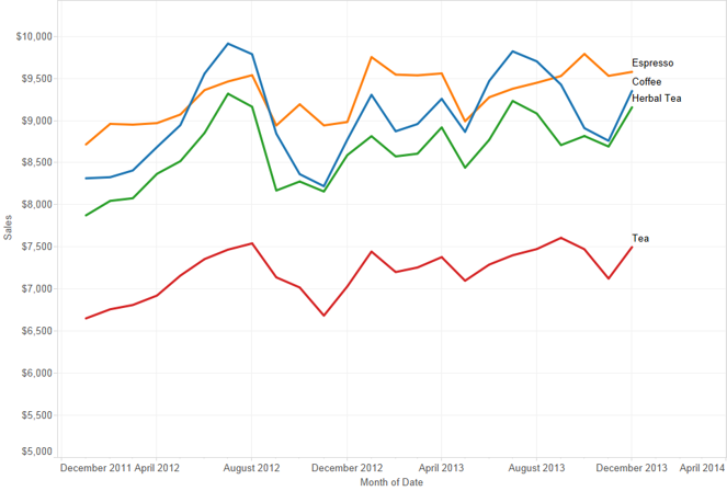
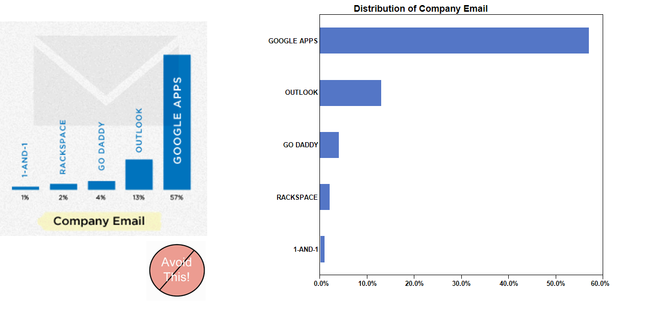
When can you eliminate legends?
- In this graph, a legend is used to indicate product types.
In this graph, product types are labeled directly.
An enligthening data visualisation will be incomplete without a well worded title
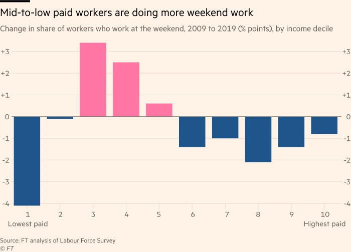
Source: The truth about weekend working, Financial Times, January 23 2020.
- More example can be found here
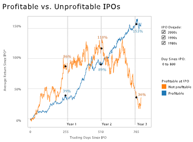
Using Annotation to tell data story
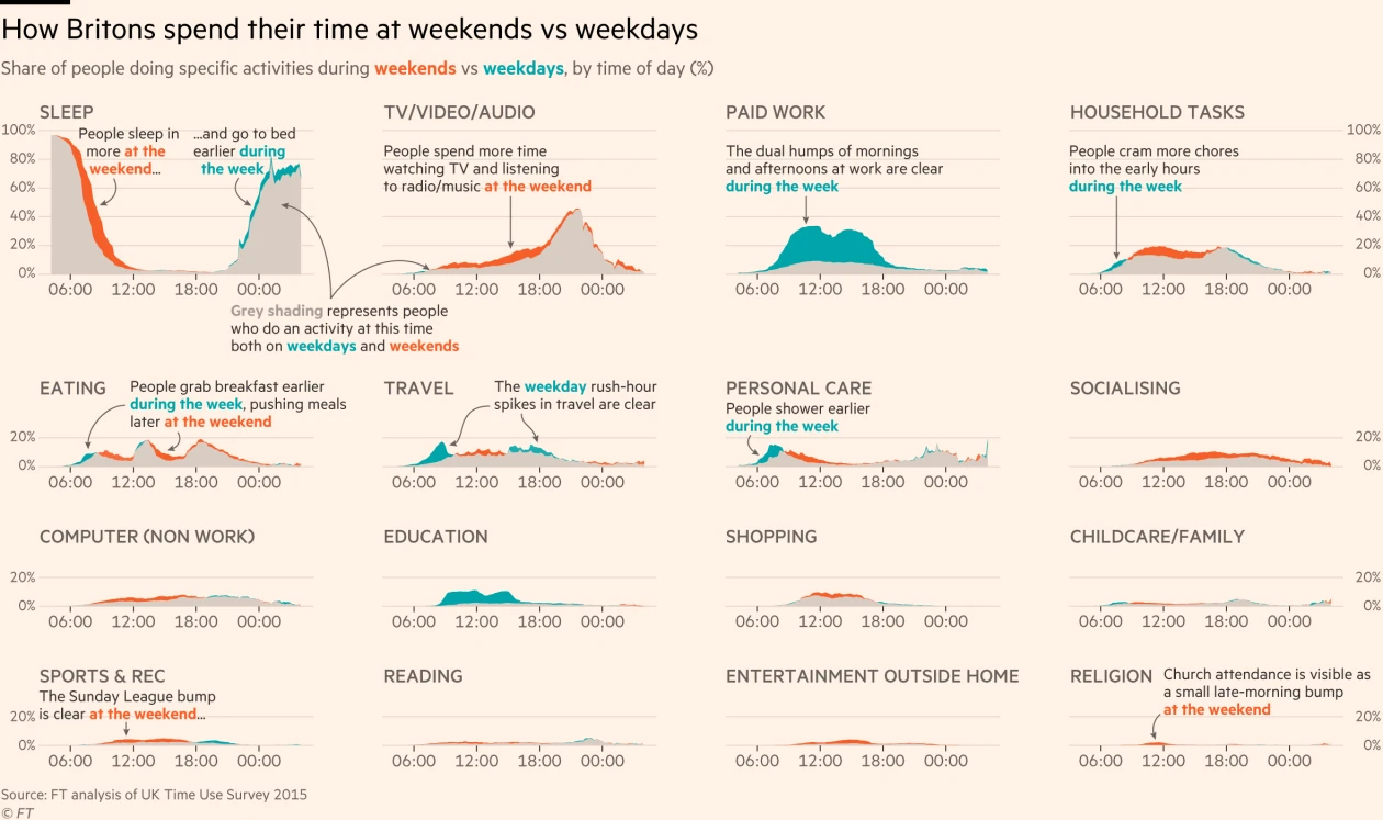
Source: The truth about weekend working, Financial Times, January 23 2020.
Graphical Integrity: Show Me the Truth
Don’t lie to yourself (or to others) with charts
Graph typography
Avoid using artistic fonts
Graph Labeling
Orientation of label should be reader friendly
Three Bugs example
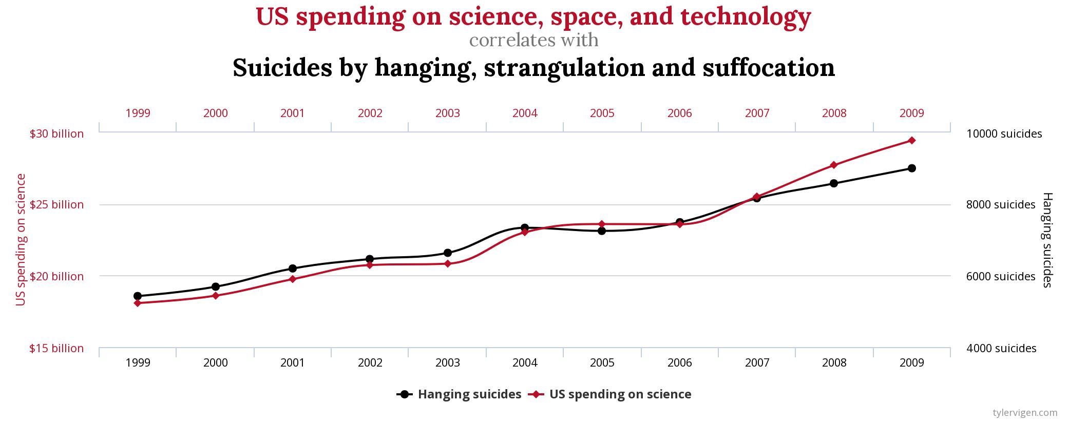
Source: Spurious Correlation
Stop the Fallacy of Visual Storytelling
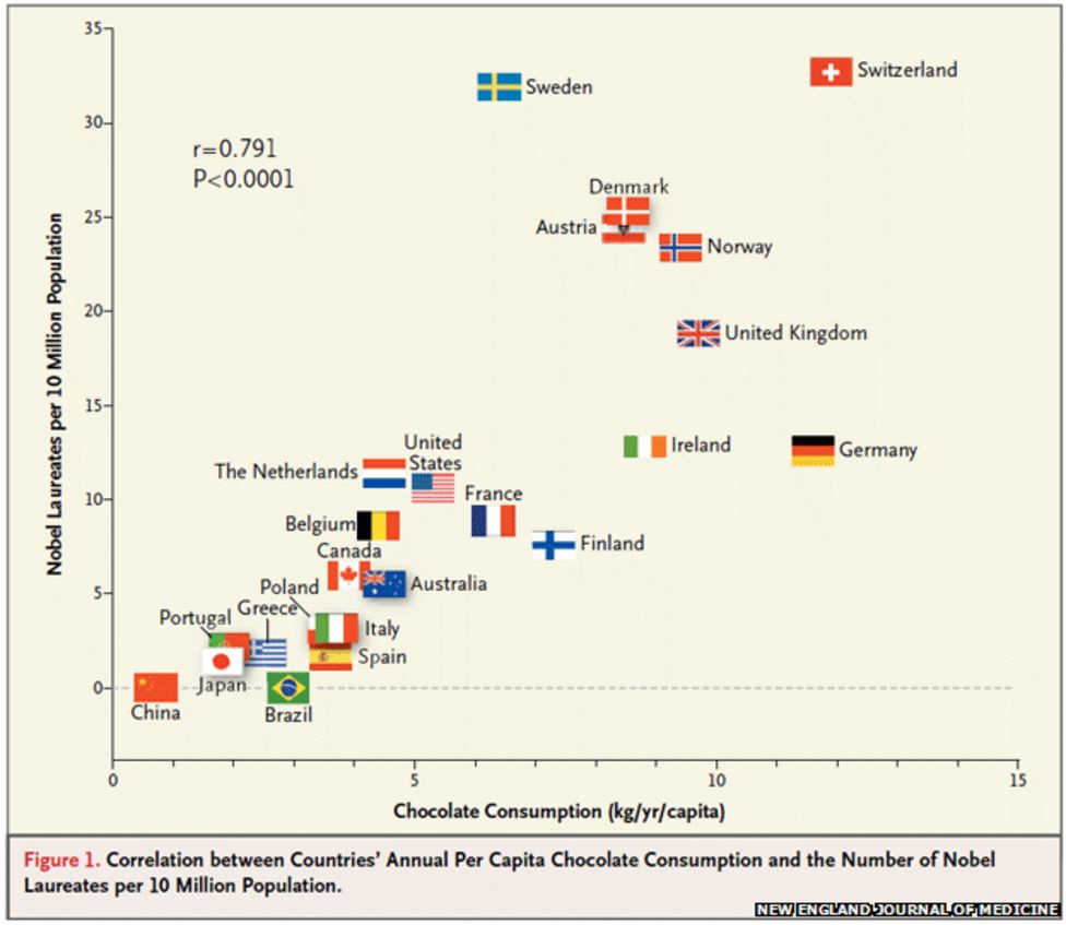
Source: Franz H. Messerli (2012) Chocolate Consumption, Cognitive Function, and Nobel Laureates, The New England Journal of Medicine.
Data Visualization: Clarity or Aesthetics?
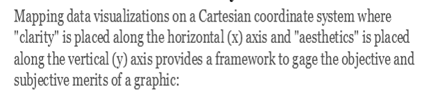
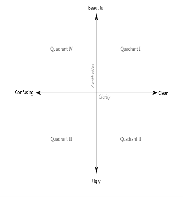
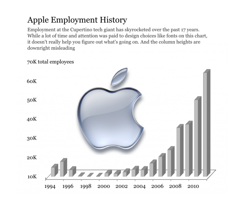
A Tale of Four Quadrants
Quadrant IV – Confusing yet Beautiful
- Why is it “beautiful”?
- Well placed & aligned title & lead-in.
- Attention to detail with font selection.
- Inclusion of image.
- Why is it “confusing”?
- Y-axis starts at 10K (column height misleading).
- 3D effect makes it difficult to gage heights.
- Title & lead-in aren’t helpful.
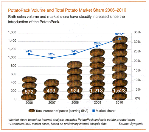
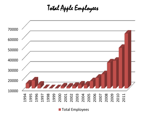
Quadrant III – Confusing and Ugly
- Why is it “ugly”?
- Horrible font & color choice.
- Grid lines are too dark & distracting.
- Format of axes (vertical x-axis labels, number format of y-axis).
- Why is it “confusing”?
- Y-axis starts at 10K (column height misleading).
- 3D effect makes it difficult to gage heights.
- No lead-in or call-outs to provide context.
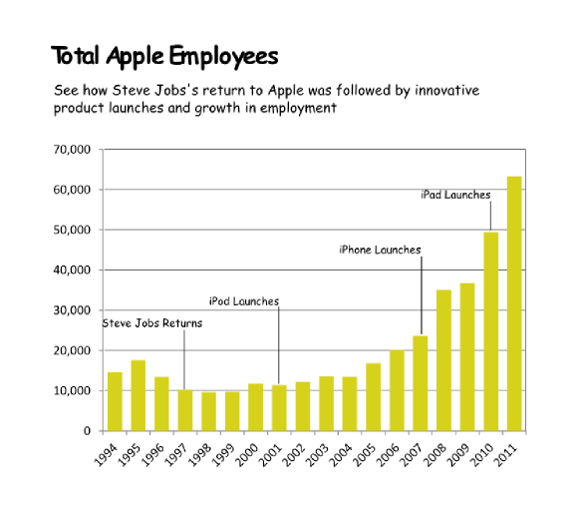
Quadrant II – Clear but Ugly
- Why is it “ugly”?
- Poor color (puke yellow?) and font (Comic Sans?) choices.
- Slightly pixelated – poor attention to image quality detail.
- Chart details – axis orientation, grid lines, outline.
- Why is it “clear”?
- The y-axis starts at 0 and the 2D columns are easy to gage.
- For the first time, we see call-outs of relevant events on the timeline.
- This time the lead-in paragraph is actually informative.
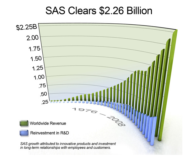
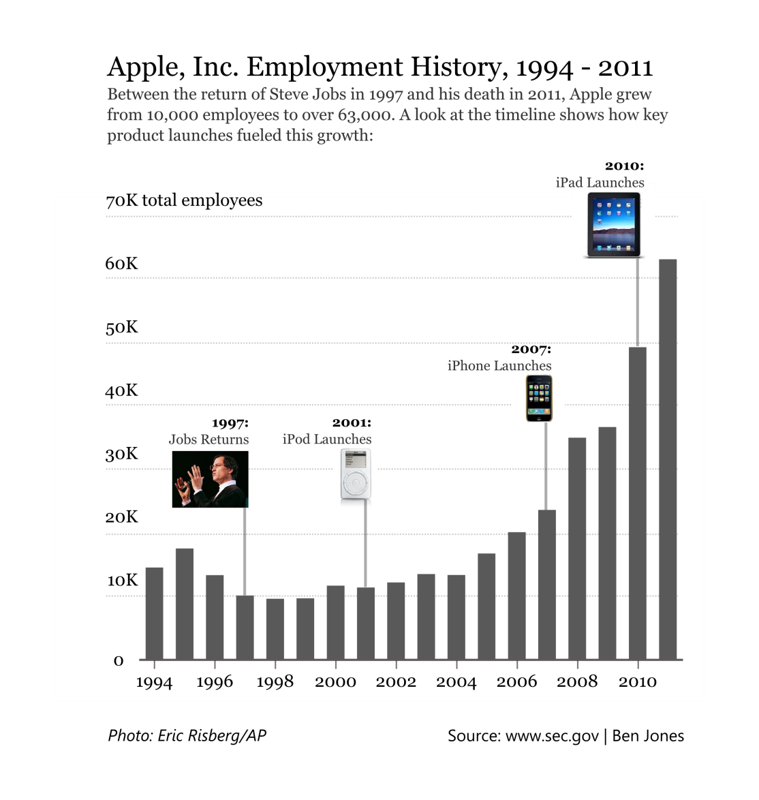
Quadrant I – Clear and Beautiful
- Why is it “beautiful”?
- Good font & color choices throughout.
- Soft gridlines don’t distract.
- All elements well aligned and spaced.
- High res images are “useful” chartjunk.
- Why is it “clear”?
- The y-axis starts at 0 and the 2D columns are easy to gage.
- Call-outs with images aid cognition.
- Improved title & lead-in verbiage provide further elucidation.
- For the first time, a photo credit and data source are included.
Learning from Peers